Home Blog Page 13

Microsoft Open Source Xamarin API Docs

0

On May 9th, Microsoft announced the open source of all Xamarin API documentation , API documentation is released under the Creative Commons Attribution 4.0 License , and any associated source code is based on the MIT license. The project is governed by Microsoft’s Open Source Code of Conduct .

The Xamarin.Android API documentation page is based on the work of Android open source project creation and sharing and is used according to the terms described in the Creative Commons 2.5 Attribution License.

According to Microsoft, the Xamarin API documentation was built using the open project mdoc toolchain for the mono project, which converts inline code comments into a dedicated directory of XML document files. When you update the source assembly, the added/deleted classes and members are synchronized to the document repository.

These API documents for open source have separate GitHub repos:

At the same time, Microsoft also migrated related projects from the old Xamarin home page to docs.microsoft.com at the following address:

The docs.microsoft.com site provides the same presentation, search, browse, localization, and versioning experience as the Microsoft .NET platform, allowing developers to filter by platform and version to quickly and accurately get namespaces, class names, and member signatures. search results.

My Review: Xamarin is basically not used by a lot of people. In the past few years, it has earned some eyeballs. 

On Windows, there are many traditional desktop development tools such as .net, qt, delphi, and electron. 
On the mobile platform anroid and ios, a lot of tools such as native, react, flutter, ionic, etc., there are many development tools that are compatible with H5 and APP. 
On the mac development platform, there is no advantage, and you have to learn the native framework to write valid code, almost learning two languages. 

The spirit of open source is good, but open source is not a panacea. Even if Xamarin attaches all the resources to the most lenient open source license, it can’t save Xamarin’s decline, 
because xamarin is originally an extremely poor framework, it is accompanied by “c#” “This big tree was born. 

Mono has been trying to compile c# to binary in these years, instead of compiling it into a virtual machine, and unity3d has long abandoned the mono c # solution, compiling the local binary, and abandoning the virtual machine that C#relies on. 

At present, the c # in unity3d is not the mono c# , nor the C# in the .net core, nor the c# under the windows.net platform, but the syntax compatibility is similar.

PDF photo editing tips you must not miss

0

In addition to reading PDF documents, Foxit readers can also perform PDF text editing, PDF image editing and other operations. Many small partners don’t know it~ Today, Xiaobian introduces the Foxconn Reader Edition to everyone, how to edit the PDF picture editing;

In the well-being version of Foxit Reader, PDF document editing is divided into two major blocks, namely editing text and editing objects. The editing text is well understood as the name suggests. The editing object is mainly for the images, shapes and gradient objects in the PDF document. These 3 kinds are edited.

Let’s take a look at the steps with it.

1. Click on the desktop icon “Fushun Reader” to open the software and select the PDF document you want to edit. The operation is as shown:

You can also set the “Fuji Reader Colloquial Edition” as the default reader and double-click the PDF document on the desktop.

2. Select “PDF Editing Tool” in “Features”.

3. Click “Edit Object” and select the image, shape and gradient to edit the object according to the requirements. Below we will introduce the settings of these 3 objects.

1) Image editing: Select the image inside the editing object; the effect is as follows, provide a comparison chart before and after editing to see Ha ~PDF photo editing tips you must not miss

2) Shape editing: Select the shape inside the editing object; the effect is as follows, provide a comparison chart before and after editing to see Ha ~

Image before editing:

Click on the selected edit image to achieve a series of shape effect settings such as color replacement, color lines, and opacity.

3) Gradient editing: Select the gradient inside the editing object; the effect is as follows, provide a comparison chart before and after editing to see Ha ~

Gradient image before editing:

Set the gradient type and effect according to each person’s happy number, and edit the gradient image effect:

Once all the content is set, click the “File” button in the navigation bar and select “Save” or “Save As”.

The Foxit reader is a fresh version, making PDF document editing and PDF photo editing easier.

Chrome will no longer allow sites to hijack back buttons

0

As the world’s number one browser, Google Chrome continues to evolve, and Google has been looking for ways to improve the usability, security and performance of all platforms. Recently, Google began researching a new feature that would prevent websites from taking over the back button in Chromium.

Since many users find that many websites or web pages make the back button in the browser almost useless because they don’t want the user to leave the current page, in this case, pressing the back button has no effect, because the browser seems to be stuck on the same page. on. This is a gimmick that uses the back button to work in the browser and uses redirection or history operations.

Google said that some pages make it difficult or impossible for users to return to their original page via the browser back button. This is achieved by redirecting or manipulating browser history and leading to abuse and an annoying user experience. Google will solve this problem by blocking any behavior that does not involve user input, which means that pressing the back button will achieve the desired results and will not allow complex code to intervene. The new behavior of the browser back button skips adding history entries or redirecting user pages, but it does not affect the history.back/forward API.

This feature is still under development and can be used on all platforms including Windows, Mac, Linux, Chrome OS, Android and iOS.

From: OSCHINA communit

Fast and reliable programming language Bosque

0

Microsoft recently introduced a new programming language Bosque, which references the syntax and types of TypeScript, as well as the semantics of ML and Node/JavaScript. Author Microsoft computer scientist Mark Marron is  dedicated to eliminating the complexities that arise during programming and creating the language Bosque that he believes goes beyond mainstream structured programming.

Structured programming is now available everywhere. Whether you’re using C/C++ or a programming language like Java, Python, or Golang, this programming idea is basically used in the development process. It was originally designed to replace the program. The disadvantage is greater than the profitable goto grammar. Researchers used looping, ordering, and selection in structured programming ideas, and eventually completely replaced the goto instructions, and such programming ideas have been popular ever since.

Bosque is based on Mark’s paper ” Regularized Programming with the BOSQUE Language “. In the paper, the author points out that the structured programming and abstract data types that emerged in the 1970s allowed developers to mask the features of the underlying hardware architecture. Focus on writing functional code, and development has become less error-prone. On the basis of this, the author proposes a new programming idea–Regularized Programming, which avoids the structure by avoiding iterative processing of low-level looping operations and enriching languages ​​with algebraic data conversion operators. Programming.

The author also designed a new programming language, Bosque, for this idea. Specifically, existing programming has been simplified, becoming a standardized form, eliminating the main source of uncertainty. Based on a series of analysis, experience and validation of runtime and programmer development, and interviews with developers, the paper identifies five major sources of uncertainty in the development process:

  • Variable state and logical frames : Introducing variability into programming languages ​​undermines the ability to infer programs in a monotonous manner, forcing programmers (and any analysis tools) to determine what is still valid after the operation and which has failed. . At the same time, variable code return values ​​and side effects on parameters (or other global states) affect program state, which also negates the need to infer logical frames for each operation.
  • Loops, recursion, and invariants : looping and recursion are the most basic challenges of reasoning, because code describes the effects of a single step, but understanding the complete construct requires generalizing the quantized properties of a set of values, and the invariants provide the required joins. However, in general, such general computing techniques are not achievable.
  • Uncertain behavior : Uncertain behavior includes undefined, specified or undetermined environmental behavior, which requires a programmer or analytical tool to reason and explain all possible outcomes. For example: sorting stability, map/dictionary enumeration order, etc. These uncertain behaviors increase the complexity of the development process and are slowly seen as technical debts that should be removed over time.
  • Does not follow “data invariant” : programming languages ​​typically provide access and update operators for individual elements in an array/tuple or fields in an object/record, which are executed on a per-element basis, resulting in a program The member updates the state of the object in multiple steps, and the invariants normally held are temporarily invalidated before recovery. In these cases, the amount of detail that must be tracked and recovered greatly increases the likelihood of errors occurring.
  • Equivalence and aliases : Programming languages ​​are at the boundaries of mathematics and engineering. Although language semantics are expressed as mathematical concepts, there are some common situations, such as: reference equality, by value, by reference or evaluation order, which is actually the default underlying. It is the von Neumann architecture. Although seemingly insignificant, these choices have a major impact on comprehensibility, such as the reference equality leads to the complexity of alias relationship reasoning, and the compilation of other architectures becomes very complicated.


These uncertainties are the source of various bugs in the program, increasing the complexity of the developer’s understanding and implementation of the application’s functionality, while making the program’s automatic reasoning very complex or completely infeasible.

Among them, according to the interview with Mark by the technology media The Register , Mark believes that the problem of variable state , loop and reference equality is the most prominent.

Taking reference equality as an example, Mark points out that when two variables point to the same object in memory, the complexity of the problem increases. “It looks very simple, but once you have reference equality in the semantics, you must constantly Consider the relationship between it and the pointer alias it introduces.”

The most familiar looping mechanism also brings a lot of complexity. It was canceled in Bosque. Below is an example equivalent to the for loop in JavaScript:

//Functor (Bosque) 

Var a = List[Int]@{...}; 
//Pre: true 

Var b = a.map[Int](fn(x) => x*2); 
//Post: List[Int]::eq(fn(x, y) => y == x*2, a, b)

Bosque is derived from the concept of standardized programming, in order to solve the problems encountered in the current structured programming, the author thinks that the rise of structured programming is the first golden age of programmers and development tools, he believes this This standardized programming model will greatly improve the productivity of developers, improve the quality of software, and bring the second golden age of compilers and development tools.

Grammar example:

Add two numbers:

function add2(x: Int, y: Int): Int {
    return x + y;
}

add2(2, 3) //5

Odd detection using the rest parameter and lambda:

function allOdd(...args: List[Int]): Bool {
    return args.all(fn(x) => x % 2 == 1);
}

allOdd(1, 3, 4) //false

Batch update properties on Record

function update(point: {x: Int, y: Int, z: Int}, value: Int): {x: Int, y: Int, z: Int} {
    return point<~(y=value, x=-point.x);
}

update(@{x=1, y=2, z=3}, 5) //@{x=-1, y=5, z=3}

Inaccessible parameters:

function tryGetProperty(r?: {f: Int, k: Int}): Int? {
    return r?.f;
}

Sign:

function sign(x?: Int): Int {
    var! y;

    if(x == none || x == 0) {
        y = 0;
    }
    else {
        y = (x > 0) ? 1 : -1;
    }

    return y;
}
See the paper and source code for details:

Conversion Copywriting: Master the Art & Science of Words that Work

0

[ad_1]

When is the last time you remember taking action on something you saw online?

What was it that enticed you to buy software, register for a newsletter, or donate to a cause?

Was it the emotional banner image?

How about the fancy animations?

Perhaps the words on the landing page?

It’s a trick question.

Everything played a part—from the basics of human psychology to the copy on the buttons. Building a content experience that compels people to take action is a holistic process. It requires the contributions of designers, writers, engineers, marketers, and strategists to create something that inspires you to take action.

But when you’re finally ready to cross the bridge from considering to deciding, it’s often the message that moves you.

In the digital marketing world conversion is king. One way to maximize impact is to optimize your website’s copy for conversions, also known as conversion rate optimization (CRO).

For marketers, understanding the value of conversion copywriting presents a huge opportunity. According to an Econsultancy report, only about 22% of businesses are satisfied with their online conversion rates.

We’re always learning how to write better, too. We’ve seen well-crafted words help our clients, but I wanted to dive deeper into the art and science behind conversion copy—what it really is, why it works, and how to do it well.

So I interviewed some conversion copywriting experts to get their perspective.

Let’s dive in.

What is conversion copywriting?

Conversion copywriter and consultant Joel Klettke says that “Conversion copy is a deliberate data-driven attempt to write something that gets people to take action.”

The term “copywriting” on its own can mean different things depending on the context. Some copywriters write advertisements. Some copywriters write web copy. Some copywriters write email campaigns and funnels.

The types of copy can be distinguished in two ways. The intention and the process.

The intent gets at what your goal is with your copy.

The process pertains to how you go about writing it.

“The difference [with conversion copywriting] is in the process: It gives the business owner so much insight into their own process, and customers, too,” says Sara Frandina, a conversion copywriter with Sara Frandina Strategies.

Skilled conversion copywriters are highly valued because the process of doing it well can be intricate and time-consuming. Fortunately, when done right, it can have an immediate impact on ROI.

What motivates our behavior online?

Let’s take a half-step back and talk about what’s going on in our brains when engaging with a website.

When looking at what motivates people’s behavior online, Web Psychologist Nathalie Nahai suggests using the “Three Brain Model” to categorize and understand the influences different types of information might have. This includes the primal system, emotional system, and rational system.

The primal system (or reptilian brain) is concerned with survival and maintenance. On the web, this relates to things like the imagery of food, subtle sexual cues, and indicators of scarcity. For example, the microcopy on an airline checkout page that tells us “only 4 seats left” activates our primal system.

triune brain model

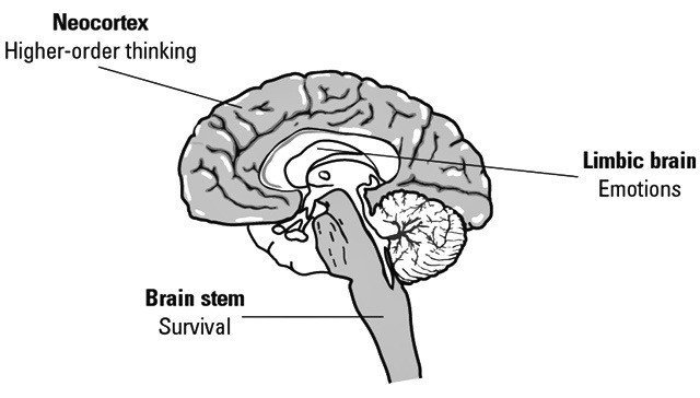
The emotional system (or limbic brain) is concerned with principles like empathy, or storytelling. On the web, this explains why we’re drawn to images or faces, or respond well to a compelling narrative. Brands like Lokai integrated their story directly with their product design and give 10% of net profits to their charity partners. This approach appeals to our emotional system.

Finally, the rational system (or neocortex) is the most evolved part of our brain. It’s concerned with logic, language, and things like processing abstract thought. On the web, this relates to product features, benefits, and other evidence for decision-making.

“We all like to think that we make our decisions rationally. But there’s a huge amount of evidence that suggests that emotion is at the base of decision making. When we look at persuasive arguments, what we’re actually doing is post-rationalizing the decisions we’ve already made at a primal and emotional level,” says Nahai.

Why does this matter for conversion copywriting?

When done well, conversion copywriting reaches all three systems on some level. It can arouse interests with an understanding of basic needs (primal), appeal to emotions by addressing genuine frustrations (emotional), and address the inner skeptic with convincing language (rational).

What should you consider to write effective conversion copy?

Tweaking your website copy for CRO isn’t one-dimensional. Multiple elements go into doing it right.

“You can’t do this stuff in a vacuum. It’s not about changing button colors, and copying and pasting formulas you found on a website. It’s a process. And you have to fall in love with the process. It’s not black magic, there’s a science and a rationale behind it, but there’s still room for creativity,” says Klettke.

Here are some things to consider to write effective conversion copy.

1. Audience

With any business strategy, you have to begin with your target audience in mind. Everything you do should be aimed at improving their experience.

Former Illinois Governor Adlai E. Stevensen, Jr. said that “understanding human needs is half the job of meeting them.”

Specifically, conversion copy should be focused on understanding the pains, gains, hopes, dreams, anxieties, and frustrations that your audience is experiencing. First, you need to show that you can understand and empathize with their experience. Then, you can identify how you can help them.

frustrated man working on a computer

“You need to be as detailed as possible. What’s their burning pain or desire that consumes them now?”, says Joe Choi, a direct response copywriter, and marketer. “What’s the unspoken question behind that, and how can you help them answer that? For example, a job seeker might wonder why they’re not getting an offer. They have a resume, cover letter, they’re going on interviews. They’re doing everything right in their mind. Do you have something that can help them?”

The better you understand your audience, the better chances you’ll have at conversions.

2. Research

Every writer I spoke to emphasized the importance of customer research. It’s the secret sauce to any effective writing you’ll find on the web.

Copyhackers founder Joanna Wiebe would agree. In her process, she says, “We begin with research and discovery all the time. This tends to be the biggest part of the work, and if it’s not the biggest part of the work, 99% of the time it means you’re doing it wrong.

There are two types of research: qualitative and quantitative.

Qualitative research (soft data) might include things like surveys, social media, user interviews, or chat logs.

“The main thing you’re doing when you collect qualitative data is looking for patterns in the way people describe their pain points, needs, and anxieties in their own words. You’re looking for trends in the language they use, what’s most commonly talked about, and what’s communicated as a high priority,” says Klettke.

You’d be amazed at the insights you can find talking to your customer service teams. I’d guess the solution to all Comcast’s customer experience issues is somewhere in the call transcripts.

Quantitative research (hard data) could include digging into Google Analytics, SEO tools like Ahrefs or SEMRush, Hotjar, or email marketing open and read rates.

In some ways, it’s more analytical and open to interpretation.

The combination of these data points leads to a more comprehensive understanding of who your audience is and how they’re talking about your brand.

3. Tone and Voice

Many brands and organizations are strategic in thinking about how they talk to their customers.

When writing conversion copy, striking a tone that resonates is key to making a connection.

But there’s a delicate balance. Some organizations worry about coming off too “salesy”. For example, a non-profit or university asking for donations might be hesitant to be direct.

It’s fair, but it’s not entirely valid.

“People worry about it more than they probably should,” says Frandina. “Lots of people feel like conversion copy can be really sleazy — but if you use that voice of customer data — it doesn’t mean you have to sacrifice your brand voice.”

In other words, if you’re speaking to your audience in a way that genuinely resonates, and what you offer aligns with their emotional brain, your message has a good chance of getting through.

Choi offers a suggestion on how we can do this in practice:

“Write as yourself and then go back and edit it. Things get done faster when you’re not constantly thinking about how you’re supposed to write. Keep a tally of words that keep coming up — how people describe their day to day life, their struggles, etc — build a keyword bank for that. Again, that’s why research is so important. Then go back and edit with those words.”

4. Context

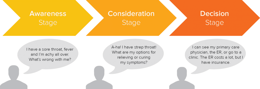
Prospective customers find your brand at various stages. Generally, you can imagine the three stages being awareness, consideration, and decision.

At each stage, the work that has to be done to move them closer to conversion changes. That means the way you write has to change, too.

Let’s use “being sick” as an analogy. In the Awareness stage, you might be thinking, “I have a sore throat, fever and I’m achy all over. What’s wrong with me?” That might lead you to different resources than already knowing you’re sick and are looking for ways to get better.

three stages a buyers journey: awareness, consideration, decision

These days, our first touch point with a brand isn’t necessarily the homepage. Sometimes it’s a blog post with a call-to-action. Sometimes it’s a long-form sales letter.

The depth of information should be tailored specifically to the page, and the presumed understanding of your audience.

Conversion optimization expert Talia Wolf says, “Knowing where your potential customer is on her journey helps you to gauge what she will most likely respond favorably to, so she feels comfortable taking the next step.”

5. Design

Copy and design have to work together. There’s no way around it.

But in practice, there’s often a struggle to figure out which one comes first.

Unsurprisingly, when it comes to conversion copywriting, the writing should drive the design.

“Writing copy and fitting it into the design is like drawing all the pictures and trying to write the story. You’ve now forced the writer to try to cram the message into a box it wasn’t made for,” says Frandina.

Good copywriters should be concerned about how the words on the page will be presented, too. “You don’t necessarily have to be a UX designer, but you need to have a good understanding of how copy and design interplay and consider that how they’re presented will influence somebody taking an action,” says Klettke.

At Clique, our interdisciplinary approach weaves together content strategy, user experience, engineering, and content marketing as a single discipline. That means our content team is involved in the wireframing process and structuring the words on the page from the very beginning.

Is that more challenging? Yes. But wireframing with the copy in mind inevitably yields better outcomes.

website sketch outline with colors

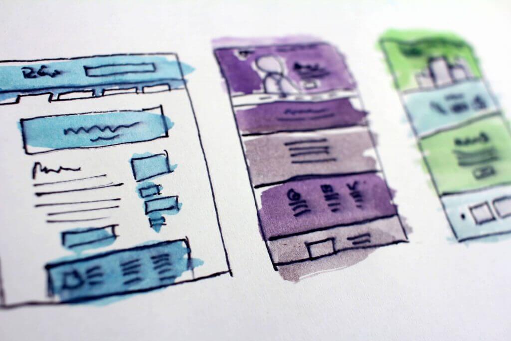
For designers, working with real copy helps them bring pages to life in a way they couldn’t with Lorem Ipsum. By adding context to the sitemap, they can better present users with the information they’re looking for.

6. Testing

One of the benefits of conversion copy is that you can always improve it.

Testing headlines, call-to-actions, or the body copy of a specific section is how to continually refine it.

“Don’t be afraid to get crazy. As long as it resonates with your audience’s desires, and you can support your claims, then it’s fair game. Now, not everyone is comfortable running outrageous headlines or copy. But I think it’s easier to push something to the limit, then dial it back,” says Choi.

But regardless of your research, the writing might flop. And that’s okay.

Klettke suggests we anticipate failure as part of the process. We can’t always stick the landing on the first attempt. But committing to the process of testing and refining your copy will pay dividends in the long run.

How can you improve your conversion copywriting today?

1. Invest in research

The first thing is to invest in understanding your audience better. Even if you’re starting with no money and no customers, you can learn more about your audience and what matters to them.

If you’re starting from scratch, Wiebe suggests a method called Amazon Review Mining to understand what people want, and what frustrates them in their own words.

  1. Identify books (or products) that relate to the problem you solve
  2. Read the reviews and track “memorable phrases”, “what people want”, and “what frustrates them”
  3. See what messages resonate most and use it in your copy

2. Get better at asking questions

I asked everyone I interviewed what their “secret sauce” was to improve their conversion copy. Everyone said some version of, “the magic is in the method.”

I’m really good at asking the right questions of my clients, their clients or their prospects. And then curating the best stuff from the interviews. Things that resonate best with clients and their audiences usually come straight from their mouths,” says Frandina.

Keeping your questions open-ended, asking thoughtful follow-ups, and getting into specifics will help elicit useful responses.

In conclusion

If you want to optimize your website for conversions, you’ve got to make sure the language is on point.

To do that well, you can start with these four key things:

  • Invest in research to better understand your audience
  • Empathize with their pains, gains, hopes, and dreams — in their own words
  • Work in tandem with your design team to amplify the right messages
  • Test. Learn. Optimize. Repeat.

Remember, you’re not creating all this content, building these great products, or supporting these worthwhile causes only to have them ignored.

You’re trying to make an impact after all, right?

Check out these additional resources to help improve your conversion copy

[ad_2]

Shopify VS WooCommerce – Best eCommerce Solution for WordPress

0

If you’re considering setting up an eCommerce website and are familiar with WordPress, you’re in luck! WordPress offers a user-friendly platform that empowers anyone to create their own website. In this article, we’ll explore why WordPress is an excellent choice for building your online shop, discuss popular eCommerce solutions, and provide helpful tips for domain selection and hosting.

WordPress is more than just a free CMS

If you worked before with WordPress websites, then you are already familiar with everything you can do on this amazing platform.

Even if you are just now starting to learn it, you will soon find out that it was built for the people. This means that you don’t have to be a coder in order to build a WP website. Anyone can do it.

Few people dared to think about what WordPress will become when the first version was released. Back then, it was merely a blogging engine, based on basic scripts and mostly HTML themes.

However, blogging was trendy at that time and this is probably why a strong community of contributors and enthusiasts quickly formed around this new platform. Why was it – and still is – so successful? There are two major reasons, and they are both closely related to the community. On one hand, there are the users. People like platforms that are open and that are in continuous evolution. They like usability, ease of use, and most of all, WordPress’ versatility due to its modules and plugins. On the other hand, there are the contributors, the coders that add to the plugins and themes repository.

Both groups are strongly connected as more users lead to more opportunities for developers, while the plugins and modules they create attract more and more users and vice versa.

Here are some of the reasons you should choose Word{ress to build a website:

  • WordPress is free
  • There are plugins for anything you can think that you would need on a website
  • There are thousands of premium themes to choose of
  • Even if you need a custom theme, it will not cost too much
  • There are at least two dedicated e-commerce plugins that are efficient and reliable
  • For every problem you encounter, you will find more than one answer on the web due to WordPress’ popularity
  • Everything is customizable with WordPress

eCommerce solutions for WordPress

There are several eCommerce solutions of which to choose when setting up an online shop based on WordPress. Each of them is an option for somebody, and whether you choose it or not depends mainly on what you want. However, I will choose the best two of them for this article and I will explain why.

Option one: Shopify

We’ll start by recommending the most popular eCommerce solution for WordPress: Shopify. This is the premium option for starting an online shop, as it will cost from $9 to $299 per month, depending on your options. However, considering all other premium options available online, Shopify is quite affordable for a medium-sized business. It’s not a mystery why more than 400,000 online shops already use this plugin. If you have a budget for setting up your shop, you can try it. You can get a free trial for the first two weeks.

Benefits of Shopify:

  • Easy to integrate into Word{ress as a plugin
  • Premium eCommerce solution, which means it features a 24/7 support
  • Shopify is secure
  • Hundreds of different designs to choose from
  • Integrations with Facebook and Twitter.
  • Facebook Messenger support
  • Multiple payment options, easy to set up and deliver invoices

Option two: WooCommerce

If your budget is limited or if you just want to try for the first time an eCommerce platform, you can choose WooCommerce, the second most popular and versatile plugin for WordPress.

WooCommerce is free, easy to set up and most of all, it was recently acquired by WordPress, which means it is officially supported by this CMS. You can also find premium themes that integrate this plugin efficiently and many more other plugins that are capable of enhancing its usability. By default, WooCommerce does not feature all types of payment and cannot deliver invoices. However, there are free and premium plugins able to fill in the blanks, all available immediately and easy to set up and integrate into your shop.

Benefits of WooCommerce

  • It’s free
  • Very easy to set up. You can post your products in just a few minutes
  • Huge community that will cover for the lack of official support
  • Many themes to choose from. Some are free, some may cost.
  • Officially supported by WordPress
  • Its functionality can be easily extended through additional plugins

Don’t forget to choose an appropriate domain name and a good hosting service

Obviously, you should start with choosing an appropriate domain name for your shop and a good web hosting service, suitable for WordPress websites.

There are several major domain registrars, such as Namecheap, Godaddy or Name.com and you can choose the one that best suits your needs. Some of them will also offer affordable hosting services while others will give you something else. Regarding the domain name, choose something that is easy to remember, and of course, related to your business. For instance, if you are trying to sell bikes, use the word „bike” in your domain name. Or, if you already have a brand, try to find a name that describes or identifies it.

Also, when you choose the web hosting service, search for a company that officially supports WordPress in order to avoid any problems caused by incompatibilities or significant downtimes caused by the use of specific plugins or scripts. Apart from the WordPress support, also look for uptimes close to 100%, 24/7 online support, and enough bandwidth for your estimated traffic for the first two or three months.

7 WordPress Website Design To Inspire You.

0

Even if you always design websites from scratch, it’s wise to take a look at the many inspirational ways that other designers have made templates their own. For instance, many of the available WordPress templates are impressive, to begin with, but they take on new life with the right touch.

Let’s take a look at a few of the most intriguing examples.

  1. Greenwich Library


Most government related websites are flat, boring and stuck in the design trends of at least five years ago. Fortunately, Greenwich Library has broken free of this mold, which makes their offering an inspiration for any designer who is tasked with updating a government run site. The responsive design loads quickly, provides key information in a highly visible location and includes a slick interface that makes navigating the site easy for anyone. It’s also a nice touch that the header photograph changes with the seasons.

  1. Travel Portland


Travel sites have to walk a fine line between being visually appealing and helpful. After all, the most beautiful design in the world isn’t going to boost tourism revenue if the site doesn’t provide basic details.

Fortunately, the team behind the custom Travel Portland template was able to capture the city’s unique vibe without making the website difficult for people to use. In fact, this responsive design has a clearly indicated and highly intuitive menu. Tying this into font choices that showcase some of Portland’s personality was a great choice that all travel website designers should take note of.

  1. The Ink Tank


This website is flat-out gorgeous! Until The Ink Tank came along, it would have been odd to think it was possible to become totally transfixed by the header of an ink website. This design makes it possible, though, and it’s quite simply entrancing to watch as the purple ink fills the box and then swirls and dances across the screen. As if this wasn’t eye-catching enough, the stunningly crafted “From Quill to Cartridge” page makes it exciting to learn about the history of ink. The Ink Tank is by far one of the inspiring sites to use WordPress, and it makes it clear that the sky is the limit for this popular website and blogging platform.

  1. Mendo


What happens when you put together a team of graphic designers who also love high-quality books? A bookstore named Mendo, followed by one of the slickest websites on the Internet. With the tagline of “a candy store for book aficionados,” you know that this isn’t going to be the typical online book buying experience.

Mendo creates their own books, and they also carefully cultivate books from other publishers. This attention to detail and beauty is felt throughout their entire site, which has such a fun transition from page to page that it’s tempting to keep clicking around long after the necessary information has been found.

  1. Epic Adventures


Reading may be fundamental, but the allure of technology is definitely stronger for most of today’s youngsters. The good news is that meeting kids at their level has always been a great way to encourage learning and personal growth. Therefore, why not use technology to get them turned on to reading?

This is the concept behind the Epic Adventures digital and print books, and the website is virtually certain to captivate the intended audience. The images look like they come from a book, but there’s an important difference: they move. As kids work their way down the site, they see an octopus with three blinking eyes, a meteorite storm threatening dinosaurs and the promise of Epic Adventures in summer 2017. As an added bonus, this is one of the few sites designed for children that’s impressive enough to catch the eye of adults.

  1. Jess Marks Photography


Picking the right wedding photographer requires more than choosing a budget and looking at reviews. You also need to make sure the photographer in question has a personality and style that will mesh well with yours. This is the main focus of the Jess Marks Photography website, and its whimsical build makes it clear right away what personality you can expect.

This particular site eschews the popular responsive style for a quirkier setup that takes advantage of plug-ins. Everything from the colors to the font choices help an engaged couple quickly determine whether or not Jess Marks Photography is a good fit, which makes the fun design a big success!

  1. Ghost Horses

Speaking of personality, it’s hard not to smile while looking through designer Ghost Horses’ WordPress site. Almost everything on the website can be altered by the visitor, including the introductory tagline of “Ghost Horses Makes Really Excellent Websites.” If you click on the arrows, you can get new results that are positive or negative, and you can also change who the tagline is referring to. Unsurprisingly, playing with this feature will teach you a lot about the designer’s personal interests and political beliefs.

As you work your way down the homepage, you’ll be able to interact with almost every feature. This is a fun way to keep people engaged, and it also helps show off what the designer can do with WordPress. This is ultimately what potential clients want to see, and Ghost Horses doesn’t disappoint.

As you can see, there truly is no limit to what you can accomplish with WordPress designs. All of these sites are using the same platform, but their differences make it clear that the designers behind them have gone far beyond the typical WordPress templates.

Done with designing? Optimize!

Now, you have to consider the fact that some of these templates can get pretty bad load times since they have tons of CSS elements and animations. You must make sure that your website is fast enough to handle it and there are a few things you should consider. As we mentioned in this article, you have to optimize web fonts, improve animation performance and most importantly, get a good WP hosting provider.

  1. You should do your research and figure out which provider is the best for you. Start with this WP host comparison.
  2. Don’t forget to make sure your WP site loads fast. Educate yourself on best practices to speed up your WP website. You’re going to lose visitors if your site loads slow!
  3. Finally, beef up your WordPress security through plugins and security measured. Enrolling on a CDN will also provide a layer of defense, whilst boosting the load speed even further.

If you need inspiration for your next project, be sure to look through these websites to get a better feel for the flexibility and versatility of the platform. Anyone who still thinks that WordPress is just for blogging is clearly way behind the times.


10 The Most Important Factors

0

[ad_1]


Creating and launching a website is a great deal. However, if you think that once you launch a website, you’re done, you’re likely to miss quite a lot. A website requires constant care and regular updates.

 How to Make Sure that Your Site is Up-to-Date

Why is updating a website important?

There are several quite important factors why you should consider regular investments to your online presence. These factors are:

  • Your rank by search engines. I bet you want to see your website on the first page of search results. Search engines “love” websites that are frequently updated as they consider that such websites provide more relevant and up-to-date content to the users. Moreover, over the time some links on your website may become a subject to link rot. If you don’t fix broken links regularly, search engines notice this and rate you lower.
  • How people perceive your website. If people land on your website and see that the latest blog posts there date two years back, they are likely to think that your business is not active or even ceased to exist. Consequently, they would opt for your competitors that are more active on the web.
  • Amount of interlinking. If you regularly post new informative and unique content, you’re likely to see people sharing it in social networks and linking to it on their websites. This is great for you in terms of SEO. However, if your great contents were created a couple of years ago, the rate if interlinking falls dramatically.

What are the three main vectors of website updates?

I hope you’re pretty much persuaded that updating your website is important. But how to approach it? Actually, there are three main types of website maintenance that you should regard. Let’s briefly review them, before we go into detail:

  • Technical maintenance. No website is perfect, and over time your website is likely to encounter such issues as broken links, 404 Errors or missing media content. You need to regularly check for the appearance of such issues and fix them in order for your website not to lose its ranking by search engines.
  • Updating your website content. For a high-ranking website, a lively, regularly updated blog section is a must. Moreover, you need to update other sections of your website, such contact details, testimonials, home page, etc.
  • Keeping your website design up-to-date. Your great content won’t win over the hearts of your website guests if it’s presented on an outdated website that looks like a ghost from the past. Design accounts for the initial impression that your guests get on your website, as well as for their desire to keep coming back to it.

10 Tips to Follow to Keep Your Website Regularly Updated

Below, you’ll find 10 most useful tips to keep your website regularly updated. These tips account for all three vectors of website maintenance, so you won’t miss a thing if you follow them. Let’s see what we”ve got here.

1) Eliminate Appearance of Broken Links

Broken links make it impossible to access some pages on your website and result in site guests” disappointment. Websites with broken links are downplayed by search engines so that fewer people stumble upon broken links.

It’s okay that links get broken: some resources may be relocated, some pages may be archived or removed. It’s not okay if you don’t check for broken links and don’t fix them.

To detect and fix broken links you can turn to online tools, such as V3C Link Checker, Dead Link Checker, Online Broken Link Checker and other tools. Moreover, if you run a CMS or e-commerce website, you may use a plugin or extension that checks for broken links.

In some cases, a manual checkup for broken links is still necessary. A page may return HTTP 200 (OK) response (that is not recognized by broken links checker), but still display the content that is not relevant.

To prevent the appearance of broken links on your website, use reliable link building strategies, minimize URL change and page removal, use shorter URLs, and avoid linking to unreliable sources and PDF documents.

If you mind all these factors and regularly check for broken links, you’ll be sure that every single link on your website works properly, no matter how many pages your website has.

 How to Make Sure that Your Site is Up-to-Date

2) Regularly Update Your Website Engine and Plugins

Keeping the software on your website up-to-date is a worthy concern. If you run a website with the help of a CMS (Content Management System) or an E-commerce engine, you need to update the engine once the newer version of it is released.

Why update your website engine?

Regular engine updates are necessary from a security standpoint. Not updating your website regularly makes your website vulnerable to hacker attacks, which is definitely not what you desire. Moreover, website engines develop and a newer version may have the functionality you always wished to have.

When updating your website, you should do it with caution. You should always create a full website backup before updating your website so that you can always revert your website to the previous state in case something goes wrong.

Update not only the engine but also website plugins. With newer plugin versions, you’ll have more functionality and features that you need.

3) Have a Frequently Updated Blog

First of all, it must be said that your website does need a blog section. Even if you run an e-commerce website, you need a blog section to make your website more engaging and to improve your position in search engine search results.

Once you have your blog, you need to update it frequently. Add new posts a couple of times every week, or at least just once a week, and both people and search engines will see that your website is alive and thriving.

Don’t know what to post? Find some ideas below:

  • Review some products or services that your target auditory is interested in.
  • Share news and insights into daily life of your business. This is the best way to let people learn about your philosophy and attitude.
  • Create a poll and ask your site guests what the things that they want to learn more about are. Then, address the points that were opted for by the majority of your audience.
  • Interview someone by email or using web technologies, such as Skype, Viber, etc. Share the video and/or the transcript of it and add more value to your blog by this.

As a perfect example of a frequently updated popular blog – Onextrapixel. The blog shares value-laden informative articles for web design professionals and newbies.

4) Make Sure Your Contact and Personal Information Is Up-To-Date

Your clients should always be able to reach you out. This is a rule of the thumb. As time passes, some of your contact details may change. Keep in mind that in this case, you need to update information on your website as soon as possible.

This also refers to your operating hours. Is there a holiday coming soon? Don’t forget to notify your clients that you’re having a day off, so they know this and don’t get upset that they can’t reach you out.

Also, mind updating the sections, such as “About Us” and “Team”, once you have something to add or to change there. The story of your business shouldn’t end somewhere back in 2015 if you launched the website back then and created the “About Us” page. A person that no longer works for you, shouldn’t be on your website as people should know whom they deal with.

 How to Make Sure that Your Site is Up-to-Date

5) Post New Testimonials

Don’t be lazy to share great things that people say about you. Fresh testimonials are definitely not a thing you should forget about. As soon as you have one or a couple, present them to the public and people will trust you more.

 How to Make Sure that Your Site is Up-to-Date

Be Active In Social Networks

All modern businesses rely heavily on the presence in social networks. If your website isn’t tied to your accounts in social networks, such as Facebook, Instagram or Twitter, it’s rather a pretty disappointing neglect that should be accounted for.

Once you connect your website to your social media profiles, you should keep/start regularly sharing some small updates there. Having a corporate party, or just a morning cup of coffee with some interesting person? Share these moments and give your followers an insight into your daily life.

To further promote your accounts on social networks, you may use widgets that display feeds from social networks on your website. It’s a great way to kill two birds with one stone, as with the help of a widget you update contents on your website and in social networks simultaneously.

 How to Make Sure that Your Site is Up-to-Date

For example, display Instagram feed widget on your home page. With no extra text, such a widget is a great tool to show your active social life and get more followers on this social network.

7) Watch Out For Outdated Imagery

Imagery is an important component of every website page. Once site guests land on a page, they esteem its design and imagery, and just then decide whether content is worth reading or not.

So, come back to your old posts from time to time and substitute obsolete imagery with the state-of-art one. This year, forget about poised, unnatural stock imagery and go for authentic photography that presents real people in real situations. Such imagery is proven to appeal more to emotions of your site guests and bring you more conversions.

 How to Make Sure that Your Site is Up-to-Date

8) Monitor Analytics and Run Usability Testing

When you monitor your website analytics, look for the pages that have the highest bounce rate. What’s wrong there? Think of how you can restructure, redesign or update the content of these pages so that they are as captivating as your other website pages.

As the number of your website contents grows over time, you need to test, whether it’s still convenient for your website guests to navigate and use your website. Running usability testing is recommended once or twice a year. Don’t neglect this practice, as the convenience of your clients should be one of your paramount concerns.

9) Make Sure Your E-Shop Is Up-To-Date

If you’re running an e-shop, you should frequently check whether your product information is up-to-date. Is the number of products available displayed correctly? Are all the product variations presented still available at your shop? Is the price still the same? Be accurate and always provide what you promise, and customers will prefer you over your competitors.

 How to Make Sure that Your Site is Up-to-Date

10) Keep In Line With Latest Web Design Trends

If updating your website contents is something pretty much like a daily routine, then updating the design of your website is a rare, but an important undertaking that you also can’t live without. Even the freshest and most exciting contents will lose their appeal if presented on an obsolete, crummy website.

To update your website design you may either higher an upper-end designer and get your website a custom redesign, or use a modern website template to quickly make your website look a couple of years “younger”. Modern website templates are a great tool to revamp your website, as they not only have visually appealing designs but also come with a number of useful plugins. To see a collection of modern website templates, check out these new WordPress themes.

 How to Make Sure that Your Site is Up-to-Date

Conclusions

Keeping your website up-to-date is a must if you strive to maximize your income with your website. You should frequently update your website blog, make sure that other content on your website is up-to-date, carry out regular technical checkups and fixes, and modernize your website design at least once in a couple of years. If you manage to successfully keep your website up-to-date, all the world will recognize your website as thriving and appealing online place, worth spending time and money.

Stay tuned!


[ad_2]

Source by [author_name]

Logo Design Rules of Thumb You Shouldn’t Forget

0

[ad_1]


The logo is that magical symbol that visually represents your company’s brand. As a graphic representation of your company’s main message and values, the logo stands at the core of the brand’s identity, and it is the element that makes a business easily memorable for the public, along with the company’s name. Needless to say, a good logo is essential to a developing business who needs to create awareness and attract new customers.  

An eye-catching logo on advertisements or promotional products will definitely help influence a buyer’s decision when ordering. More often than not, people feel more confident to make a purchase from a brand with a cool logo design that got their attention in the first place. And that’s what a good logo should do: not only attract the consumer’s attention, but also make sure that the business logo is unperceivable imprinted in the consumer’s memory.

Consequently, good designers will opt for a minimal logo design, a simple text, an illustration, a picture, or even a symbol that captures the essence of the brand’s message rather than delivering a message that is too complicated and too hard to remember.

As the logo contributes so much to your company’s visibility and credibility, there are certain rules to swear by and mistakes to avoid when designing it.

Research and Strategy

The first step of any new logo design project is thorough research. Understanding the competition, asking the right questions, respecting brand’s heritage, exploring combinations and looking for inspiration in order to formulate the right strategy are necessary steps towards finding a successful compelling visual solution.

Knowing what styles would work for certain fields of activity/type of business, as well as having the skills to properly use those styles, are the details that will make your designs stand out.

Logo Size

When it comes to size, try not to impress the customer with a big, bold, intricate design that covers more space than the text of the brochure. Logo is important for branding but, remember, sometimes less is more.

Originality

We all know that every logo designer have to align to the latest logo design trends to stay on top. But that doesn’t mean you can’t express your own vision. Always dare to be different. Introduce wit and humor into your designing work. Impress your audience with a unique, easily recognizable logo that will tell the company’s story in the best possible way. 

Placement

The logo can be placed in the right or the left corner (most people say upper left is the best), and never in the middle of the page. Of course, there are exceptions: the logo can be placed in the middle of the page too, provided that the overall layout of the page is centered, and that there are no other elements on the same row to compete with the logo.

Style

To make sure your message gets to the right audience, carefully choose one or two fonts which perfectly match the outlook of the company. Of course, you can go with Comic Sans if you want, but that might make your message seem like a joke and this is not what you are after.

If you want your client to be pleased with the logo you’ve created, always keep in mind their set of tastes, which sometimes can be different from yours. Make sure you have all the data (client’s needs and wishes, company’s background, values and main message) before getting to work because every project requires a different style. A/B testing is an inevitable part of the designing process, but starting on the right foot will help avoid mistakes which often result in extra hours of work.

Color

Colorful designs are attractive but too much color can hurt the eye. To get a meaningful, memorable logo, opt for one color and tone it down to express professionalism, simplicity, and reliability. Colour schemes should be managed carefully, whether you choose a complementary color scheme (think of the Firefox logo) or an analogous color scheme (the BP oil logo is a good example). Color contrast can be used to control mood like McDonald’s did by using analogous warm colors to induce appetite.

Device compatibility

Fresh, minimal designs are preferred today by most big companies: IHOP, Microsoft, Windows, and Netflix went from bold 3D logos in the 2000s to the simple, fresh designs they have today, and not only for style reasons. Flat styles scale better, and that makes them compatible with most browsers and mobile devices. In a mobile world, compatibility with smartphones and tablets is vital. If we think about page load time (on mobile and desktop), minimal logo design is also beneficial due to small file size which doesn’t slow down the website.


The Perfect logo

A successful company will have a consistent design that people can easily associate with the brand. We have mentioned numerous examples which prove that a clean branding image is at the core of a successful marketing strategy.

Therefore, whether you go for monolines, a hand drawn logo, a vintage style logo or a dynamic logo, paying attention to the details mentioned above will help you avoid the need of rebranding, which could be a herculean task.


[ad_2]

Source by [author_name]

The Mac Photo Editor That Adapts to Your Style and Skill Level

0

[ad_1]


As an online professional, you no doubt spend a portion of your time working with photo content. Clients may provide some photo material, and some may come from stock photo resources. The quality may vary; but even when it’s good, you often wish it would be better, or have greater eye-catching appeal.

The problem is, using photo editing software to achieve the results you’re want isn’t always easy, and if you’re a web designer or an online marketer, you don’t always have the time to work your way up a steep learning curve. A flexible, versatile application is almost by definition a complex one, and complexity has a habit of becoming an integral part of an application’s UI.

If you’re a Mac user, photo editing just got easier.

1Luminar

               No matter your skill level, you can edit photos as in this example with Luminar.

  • With Luminar you no longer have to be satisfied with simply using the best image available; creative imagery is the new norm.
  • Professional-looking photographs help brand you as a pro.
  • Online marketer? See the difference eye-catching images can make.

Try Luminar image editor for Mac; and see the difference.

Luminar Adapts to Your Skill Level; It’s the First Photo Editing App to do So

Luminar is a complex tool. That’s necessary if it’s going to be able to test your creativity to the max. That doesn’t mean the UI needs to be complicated. In fact, the exact opposite is true. You can achieve professional-looking results on your first try. In spite Luminar’s versatility, its learning curve is practically non-existent. This photo editor Mac users are so crazy about, really does adjust to your style and your skill level.  Click here to compare Luminar with Lightroom and Aperture.

Examples of how straightforward it can be to edit a photo:

  • Clone an Area of an Image

Luminar’s Clone Stamp tool enables you to select a portion of an image, clone it, and paste the cloned part on another part of the image, using a brush. The process is simple. Select a location, hold the location while clicking on the area to be cloned, select another area, and paint over it to paste the cloned image. Once you’re satisfied with the result, click “Apply”.

2Luminar

  • Using the Color Splash Tool

The color splash effect can be accomplished several ways, none of which require complex techniques. For example, using the Color Splash tool to add a splash of color to a B&W image involves loading a color image file, selecting the B&W filter, clicking on the brush icon, selecting the Mask Erasing mode, and painting over a part of the monochrome image to restore the color.


Get Creative with These Three Luminar Filters

Many of Luminar’s features are designed to help you maximize your creativity. These three filtering techniques are among the most popular. Like most other features that make up this Mac image editor, using each of these is about as simple as it gets.

Creating a Dramatic Effect – Dramatic effects tend to draw visitor attention. This feature is no less popular than adding texture, and possibly more so. It’s one reason why Luminar is the image editor Mac users favor. This video demonstrates how the slider button on the Dramatic filter can give a photo a gritty, urban, finely detailed look.


Working with Color Temperature – This video shows you how you can make an image more relaxing by adding a cool bluish hue, or make it more intense by adding a reddish-orange hue. It’s simply a matter of selecting Color Temperature from the filter menu, and adjusting the temperature and tint slider buttons to get the sought-after result.


Texture Overlay – Adding texture with the Texture Overlay filter can be fun; and can also produce subtle or powerful, yet attention-getting effects. Texturing is one method of producing uniquely creative images. It’s an easy, 3-step process, as shown in the video. Select the Texture Overlay filter, choose a texture, and adjust the lightness/darkness slider.


5 Useful and Exciting Features Unique to Luminar

3Luminar

Workspaces – Editing an image sometimes necessitates selecting more than one filter. The Workspaces feature enables you to preset and save subsets of filters for use on various types of images; saving you search time. Subsets can be added to, or modified.

4Luminar

Golden Hour – Golden Hour is a must-have filter if you take a lot of sunrise or sunset shots. All too often, the results are either too dark, there is too much contrast, or subtle tones appear washed out or disappear entirely. You can restore, intensify, or emulate these subtle tones using the Golden Hour slider.

5Luminar

Split Color Warmth – Photos often contain both warm colors and cool colors. This creative toning tool’s two sliders allow you to adjust either color type to produce added warmth, or to add a cool hue.

6Luminar

DeHaze – Mist, haze, or fog sometimes add to an image and at other times detracts from one. With the DeHaze single slider button, you can bring out detail that would otherwise be lost.

7Luminar

Split Toning – With this tool, you can add color to a shadowy area in a photo using the hue and saturation sliders. A highlighted area can also be modified by the same process. An additional slider, “Amount”, can be activated to increase the overall intensity of an image.

Luminar can be used as a standalone application, as an extension for Photos, or as a plugin for Photoshop, Aperture, or Lightroom. This Mac photo editor will also be made available to PC users early in 2017. You’re invited to take Luminar for a test spin to find out more about this powerful, yet easy to use image editor.


[ad_2]

Source by [author_name]