Introduction to accepting cryptocurrency payments on WooCommerce using Sellix.io without document verification
Cryptocurrency has gained a lot of popularity over the years and has become a preferred payment option for many customers. WooCommerce is an e-commerce platform that allows businesses to create online stores and sell products or services. It has become increasingly important for businesses to accept cryptocurrency payments to keep up with the changing times. However, document verification can be a hindrance for businesses that want to accept cryptocurrency payments. This is where Sellix.io comes in. Sellix.io is a payment gateway that allows businesses to accept cryptocurrency payments without the need for document verification. In this article, we will discuss how to accept cryptocurrency payments on WooCommerce using Sellix.io without document verification.
Setting up a Sellix.io account and creating a store for cryptocurrency payments
The first step to accepting cryptocurrency payments on WooCommerce using Sellix.io is to set up a Sellix.io account. To do this, visit the Sellix.io website and sign up for an account. Once you have created an account, you will be redirected to the dashboard. Here, you can create a store for cryptocurrency payments.
To create a store for cryptocurrency payments, click on the “Stores” tab on the dashboard and then click “Add Store”. Fill in the necessary details such as the name of the store, the store URL, and the type of store. Next, choose the payment method as “Cryptocurrency”. You can then customize the store as per your preference.
Integrating the Sellix.io plugin into WooCommerce for cryptocurrency payments
Once you have created a store for cryptocurrency payments on Sellix.io, the next step is to integrate the Sellix.io plugin into WooCommerce. To do this, you need to download the Sellix.io plugin from the WordPress plugin store. Once you have downloaded the plugin, go to the WordPress admin dashboard and click on “Plugins”. Then click on “Add New” and upload the Sellix.io plugin. Once the plugin is installed, click on “Activate”.
Customizing the cryptocurrency payment options for your WooCommerce store using Sellix.io
After you have successfully integrated the Sellix.io plugin into WooCommerce, the next step is to customize the cryptocurrency payment options for your store. To do this, go to the Sellix.io dashboard and click on “Stores”. Click on the store that you created for cryptocurrency payments. Next, click on “Payment Options”. Here, you can customize the payment options as per your preference. You can add or remove cryptocurrencies, set the minimum and maximum order amounts, and set the transaction fees.
Creating a cryptocurrency payment gateway on WooCommerce using Sellix.io
Once you have customized the cryptocurrency payment options for your store, the next step is to create a cryptocurrency payment gateway on WooCommerce using Sellix.io. To do this, go to the WordPress admin dashboard and click on “WooCommerce”. Then click on “Settings” and go to the “Payments” tab. Here, you will see a list of payment options. Look for “Sellix Cryptocurrency” and click on “Set up”. Enter your Sellix.io store URL and API key. You can also customize the payment gateway as per your preference.
Accepting different types of cryptocurrencies for payments on WooCommerce through Sellix.io
Sellix.io allows businesses to accept payments in different types of cryptocurrencies such as Bitcoin, Ethereum, Litecoin, and more. To accept payments in different types of cryptocurrencies on WooCommerce through Sellix.io, you need to customize the payment options for your store. As mentioned earlier, you can add or remove cryptocurrencies from the payment options, set the minimum and maximum order amounts, and set the transaction fees.
Advantages and disadvantages of using Sellix.io for accepting cryptocurrency payments on WooCommerce without document verification
There are several advantages of using Sellix.io for accepting cryptocurrency payments on WooCommerce without document
Advantages and disadvantages of using Sellix.io for accepting cryptocurrency payments on WooCommerce without document verification
As with any payment gateway, there are pros and cons to using Sellix.io for accepting cryptocurrency payments on WooCommerce without document verification.
Advantages:
Simple setup process: Setting up a Sellix.io account and integrating the plugin into WooCommerce is relatively simple and straightforward.
No document verification: Unlike other payment gateways that require extensive document verification processes, Sellix.io allows merchants to accept cryptocurrency payments without any document verification.
Wide range of accepted cryptocurrencies: Sellix.io supports a wide range of popular cryptocurrencies, giving merchants more flexibility in accepting payments.
Low transaction fees: Sellix.io charges a competitive transaction fee of 2% per transaction, which is significantly lower than other payment gateways like PayPal and Stripe.
Disadvantages:
Limited customization options: While Sellix.io allows for some customization of payment options, the range of customization options is limited compared to other payment gateways.
Limited payment options: Sellix.io only supports cryptocurrency payments, which may not be suitable for merchants who require other payment options like credit cards and bank transfers.
Limited customer support: Sellix.io does not offer live chat or phone support, which may be a disadvantage for merchants who require immediate assistance.
Best practices for accepting cryptocurrency payments on WooCommerce using Sellix.io without document verification
To ensure a smooth and secure cryptocurrency payment process on WooCommerce using Sellix.io, here are some best practices to follow:
Clearly communicate cryptocurrency payment options to customers: Merchants should clearly communicate the accepted cryptocurrencies and payment process to customers to avoid confusion and ensure a smooth payment process.
Monitor exchange rates: Cryptocurrency exchange rates are known for their volatility, so it’s important for merchants to monitor exchange rates and adjust prices accordingly to avoid losing money.
Use strong security measures: Merchants should use strong security measures like two-factor authentication and SSL encryption to ensure the safety of their customers’ sensitive information.
Test the payment process: Merchants should test the payment process using a small amount of cryptocurrency to ensure that everything is working properly before accepting large payments.
Stay up to date on regulations: Cryptocurrency regulations are constantly changing, so merchants should stay up to date on the latest regulations to avoid any legal issues.
Conclusion
Accepting cryptocurrency payments on WooCommerce using Sellix.io without document verification is a simple and secure way for merchants to expand their payment options and cater to a wider audience. By following best practices and monitoring the cryptocurrency market, merchants can take advantage of the benefits of cryptocurrency payments while minimizing any potential risks.
In conclusion, if you want to stay ahead of the curve and take advantage of the growing trend toward cryptocurrency payments, registering for a Sellix.io account is a smart move. With its intuitive interface, a broad range of features, and commitment to security and privacy, Sellix.io is the ideal solution for anyone looking to accept cryptocurrency payments on WooCommerce without document verification. So why wait? Register today and start enjoying the benefits of cryptocurrency payments on your WooCommerce store!
Thanks to its simple interface and powerful functions, an increasing number of designers and developers choose Adobe XD over traditional Photoshop or Sketch to finish their app or website.
However, like a double-edged sword, because of its simplicity, Adobe XD also makes it a bit hard for designers and developers to precisely visualize their ideas or move on smoothly to the next design stage. That’s why many experts use Adobe XD with plugins to simplify their design and development process.
With that in mind, here we’ve picked 15 of the best free Adobe XD plugins for designers and developers to speed up their product design workflow.
Let’s look at these plugins now:
Color Designer: Create color palettes, shades and tints for your design
Price: Free
Colors in UI/UX design are important visual elements that can evoke certain emotions and visually deliver product or service ideas. A good color palette expresses brand concepts and helps capture the user’s attention at first sight.
If you are using Adobe XD and don’t know what colors can stand out your design, the Color Designer plugin would help you create a standout color palette. Simply pick the desired color and Color Designer will help you generate related colors, shadows and tints for your project.
You can download it for free.
Mockplus: export designs and assets to streamline your product design collaboration & handoff workflow
Price: Free
Designing a good app draft is only the start of the product design workflow. To create an app that users love, designers also have to share the draft with other team members, collect feedback, collaborate and iterate on it before handing over the final draft to engineers to implement the app. This process can be complicated, time-consuming and often needs to be done in different tools.
But, fortunately, now you have Mockplus, a web-based product design platform, to help you connect your entire product design workflow in one shareable cloud place, all the way from wireframing to prototyping, collaborating and developer handoff.
All designers, developers, product managers, clients, stakeholders and others in your team can join a project via a single link, and complete their parts effortlessly online.
Its plugin for Adobe XD is an important tool to help you export your designs and assets to Mockplus, where your entire team can collaborate and hand off these designs with accurate specs, assets and code snippets.
You can download it for free.
Stock Image: quickly search for the image you need to fasten your design workflow
Price: Free
Selecting images will never break your app design workflow any longer.
As a designer, you may have thousands of stock images saved on your computer and find it is very difficult and time-consuming to search for the right one when you need it. Luckily, Stock Image provides tons of images that are ready to use whenever you want, without leaving Adobe XD. This speeds up the design process and gives you thousands of high quality images at your fingertips.
After installing the plugin, start the plugin and search for any image you need with keywords, filters or even by using a reverse image search. With Stock Image, you will save hours not tediously searching for images.
You can download it for free.
UI Faces – find the right avatar for your design without leaving Adobe XD
Price: Free
When designing social or chat apps, designers may need hundreds of faces for profile pictures to create realistic interfaces. However, searching for these faces manually can eat up hours and distract you from your main goal.
Try out the UI Face plugin for Adobe XD. The plugin provides high-quality face images from Pexels, Unsplash, Random Users and other stock websites. There are also additional filters, such as age, gender, hair color, emotions, and more, to help you find what you need quickly.
You can download it for free.
Icondrop: get the right icons and illustrations to beautify your design
Price: Free
Icons, images and illustrations are common elements in a design and help bring visual appeal to your app or website. With Icondrop for Adobe XD, you get access to over 3 million design assets, such as vector icons or illustrations.
Once in the plugin, simply search for what you’re looking for and Icondrop will insert it directly into your design.
You can download it for free.
Icon4Design: search for vector icons and labels to improve your design
Price: Free
If you only need vector icons to improve your Adobe XD design, try out the Icon4Design plugin. There are over 5000 free and high-quality vector icons and labels ready, right inside XD. Easily type a name or keyword and you’ll get dozens of icon collections in different styles.
You can download it for free.
UnDraw: bring illustrations to your Adobe XD without any cost
Price: Free
The popular UnDraw website is also an exclusive plugin made for Adobe XD users who want to add any of their unique illustrations into their personal or commercial design projects. Unlike Icondrop above, which offers both free and paid illustrations, UnDraw is open source so images and illustrations are all free.
You can easily browse or search for the illustrations you want and change them to match your palette. You can also download any illustration and reuse it anywhere you want.
You can download it for free…
Lorem Ipsum: Generate placeholder texts for your layouts
Price: Free
Working on a wireframe or mockup and want to add placeholder text quickly? The Lorem Ipsum plugin helps you fill in any blank text elements with just a few clicks.
After installing the plugin, it only takes three simple steps to add placeholder text: select the blank text element, choose the desired dummy text type from a list and then insert the text.
This plugin fits all your needs and has been designed to be as simple as possible.
You can download it for free.
Google Sheets: enrich your design with real content and data from Google Sheets
Price: Free
Data visualization is often one of the most challenging aspects that designers face when designing management apps or apps with dashboards. If you need a better way to visualize data on your app or website, download the Google Sheets plugin for Adobe XD.
With this plugin, you can easily import your data sheets into your design so you can collaborate with your team and create dynamic designs without leaving Adobe XD.
You can download it for free.
Chart: create charts with random, tabular, or JSON data for your design
Price: Free
Chart is a plugin that helps you create various charts for your Adobe XD design. With Chart you can visualize data from any source file, such as random data, Tabular data or JSON data. In total, there are 16 chart types to help fit your design needs.
You can also customize your charts further with templates, custom color palettes and more.
You can download it for free.
Rename It: Rename your layers and artboards for better management
Price: Free
Organizing and managing layers and artboards is a real headache for designers, especially when working on a large project in Adobe XD, Photoshop or Sketch.
Rename It is a simple plugin and does what it says on the tin. It enables designers to rename layers and artboards to better organize and manage them.
You can rename design layers through sequences, layer names, width and height. You can also quickly find and replace any desired layer names by entering relevant words and characters.
You can download it for free.
Super Position: Create or access your design system in Adobe XD to keep your design consistent
Price: Free
As we all know, a good brand design system provides a unified design guideline and helps designers create consistent apps across teams. Super Position is a perfect plugin that helps your teams view and access your brand design system directly in Adobe XD.
If there is no existing design system created in advance, Super Position helps you create one from an existing website online. Simply enter the website link and all design tokens will be detected and show up in the plugin for later use.
You can download it for free.
Maps Generator: Insert custom maps to your Adobe XD design
Price: Free
Maps are incredibly important for apps and websites, and it can be difficult to quickly find an accurate map for your designs without simply using screenshots. Now, with Maps Generator, you can create a map in your design with a simple plugin.
You can customize the zoom level, map type and custom design styles however you like to create the perfect map for your design.
You can download it for free.
Web Export: export design files to HTML or CSS codes
Price: Premium
Web Export is a great plugin that lets you export your Adobe XD design in HTML formats and export the CSS codes to help speed up the design-developer handoff.
There are additional styles, classes and attributes that support popular web frameworks.
You can also add markups to explain important design details or add important information.
This is a useful tool, especially for smaller teams that are less adept at coding, but need to share code and development information with developers, speeding the entire handoff to the developer.
You can download it for free.
UserTesting – test your design and capture customer feedback directly in Adobe XD
Price: Free
User testing plays an important role in helping designers create great user experiences. With the UserTesting plugin, you can run a test directly in Adobe XD and collect real customer feedback inside the design.
You can download it for free.
Conclusion
These are all our collections of the best free plugins for Adobe XD. You can freely try them all to see which one, two or more of them can streamline your product design process.
This post was originally published October, 2019. It has been updated for accuracy and comprehensiveness.
For UX/UI designers, wireframing a new app or website is the foundation when starting a new project.
Wireframing tools allow designers to mockup professional-level, new product designs and workflows, without the need for high-investment prototypes. They help teams by finding problem areas and user experience issues within a new app before it’s launched, help explain and share with key stakeholders within an organization, and act as a repo for all feedback on a new product.
Best Free Wireframe Tools in 2024
Figma 👈 Clique favorite
InVision 👈 Clique favorite
Draw.io
Pencil Project
Miro 👈 Clique favorite
Wireframe.CC
MockFlow
Jumpchart
Framebox
Mydraft.CC
Wirefy
Wireframing tools have become crucial for those who work in fast-paced development teams and need to have rapid-product iteration.
However, many of the most-popular wireframing software products – think Axure RP, the Adobe Suite, Marvel, Lucidchart – are expensive and are focused on higher-detailed UX/UI features such as advanced prototyping.
Luckily there are many free wireframing tools available to UX/UI designers who are freelancing, own their own business, work for a startup, or have little budget available for their tech stack – and for non-designers mapping out workflows for things such as onboarding and training, email lifecycles, and organization charts.
The Best Free Wireframing Software in 2024
Here are the free wireframing software apps that give design and non-design professionals the tools to create free wireframes.
All the tools in this list have an offering that is free forever, meaning those tools offering free trials were left off the list – although we do mention those wireframing options after our ranking.
These tools are ranked according to user-review ratings on satisfaction from the software-review website G2.com:
1. Figma 👈 Clique favorite
User-review rating: 4.5/5
Type: Web-based, Freemium
Overview: Figma is an all-in-one design platform for UX/UI pros and offers a robust free offering for creating wireframes. It’s starter package is completely free and is one of the most robust free offerings on this list – 3 active projects, 30 day revision history, 2 editors at any time, and unlimited cloud storage.
The first paid tier (which is free for students with a valid school email address) is $12/mo per editor and includes an upgrade to unlimited active projects and version history, custom permissions, private boards, and team collaboration features.
2. InVision 👈 Clique favorite
User-review rating: 4.4.5
Type: Web-based, Freemium
Overview: InVision is an all-in-one wireframing, prototyping, and mockup tool for designers and is one of the most well-known brands in all of wireframing software.
Invision came out of applications, specifically Photoshop (at the time) not having screens that could interact with each other (also why many moved to Sketch). It filled the void of
It does require some sort of external application (we like Sketch) to create the screens to be bought into InVision.
InVision’s free wireframing plan gives individual UX/UI designers the tools create one active prototype or wireframe at anytime. It’s a basic plan designed mostly for freelancers and those not working collaboratively.
Overview: Draw.io is a completely free and open-source wireframing software that feels similar in UI to Google Docs. It’s a simple layout with powerful features. Simply put, it may be the most robust free offering of any of the free wireframing tools on this list.
Users can export designs to their Google Drive, Microsoft OneDrive, their desktop, or directly supported integrations including Gliffy, Lucidchart and more. An added benefit is it’s active open-source community that works to fix product bugs and issues, and add new features.
4. Pencil Project
User-review rating: 4.1/5
Type: On-premise, Open source
Overview: Project Pencil is a completely open-source and free wireframing and prototyping tool. It has an unlimited amount of designs for UX/UI pros to utilize and all of its features come completely free.
The open-source community is another perk, meaning developers are constantly keeping the tool updated with new features and security.
5. Miro 👈 Clique favorite
User-review rating: 4.7/5
Type: Web-based, Freemium
Overview: Miro, which previously operated under the name RealTimeBoard, is an online whiteboarding tool for distribution product and UX teams. A nimble tool for fast prototyping, Miro is extremely collaborative and akin to using an extremely light version of figma.
Miro isn’t as robust as other dedicated prototyping tools, which sounds like a negative, but actually serves as one of its strengths, since its limitations help facilitate faster prototyping, with an experience that feels like sketching on a whiteboard in a virtual room with the rest of your team.
Miro is free for your first three boards, at which point each board costs $3 per-day-logged-in, or you can build unlimited boards for $15 per month per user.
6. Wireframe.CC
User-review rating: 3.8/5
Type: Web-based, Freemium
Overview: Wireframe.cc is a browser-based free wireframing solution for designers on the go. Accessible anywhere through a browser, it’s a simple and cluster free tool with a sleek UI. The free version allows for users to create one simple wireframe at a time and is equipped with tools to customize the grid layout, typography, canvas size, and more.
The next level for premium pricing is $16/mo per user and allows for unlimited projects and revisions, custom branding, and exporting directly into PNG format.
7. MockFlow
User-review rating: 3.4/5
Type: Web-based or On-premise, Freemium
Overview: MockFlow is an all-in-one UI tool that offers free mockup and wireframing features in its forever free plan. Its free offering allows for one active UI project at anytime, two reviewers per project for collaboration, feedback, and sharing, and basic wireframing and mockup features.
MockFlow’s entry-level paid package starts at $14/mo per user and includes unlimited projects and reviewers, version history, and MockFlow’s UI asset library.
8. Jumpchart
User-review rating: 3.2/5
Type: Web-based, Freemium
Overview: Jumpchart is a browser-based wireframing tool that gives designers the ability to mockup and plan a website wireframe to share with key stakeholders, clients, developers, and more. It includes one active project at a time, 10mb of storage, 10 pages per month, and 2 users per project.
Jumpchart’s first paid tier starts at $5/mo and includes 5 projects, 1 gig of storage, 25 pages per month, and 5 users per project.
9. Framebox
User-review rating: n/a
Type: Web-based, Freemium
Overview: Framebox is the second completely free wireframing tool on this list. With no paid plans, all the features of Framebox are included directly on their website’s easy to use web app. It’s a complete drag-and-drop tool that allows designers to sketch wireframes using UI elements and allows users to sign in to save progress and have revision history. The tool even allows for UX/UI designers to send their work with a custom link to their entire team or key stakeholders for easy online sharing and feedback.
10. Mydraft.CC
User-review rating: n/a
Type: Web-based, Open source
Overview: Mydraft.cc is a completely open source and free wireframing tool that is accessible anywhere you can use a browser. It has a clean and easy-to-use wireframing canvas and comes packed with hundreds of free shapes and icons that have a simple to use search bar.
It’s quite a power wireframe editing app that is kept updated by their community of developers, with it being updated recently as two weeks ago as of the publish date of this article.
11. Wirefy
User-review rating: n/a
Type: Desktop, Open source
Overview: Wirefy is a completely free wireframing software that is open-source and comes available in a desktop download – in this case, downloading a Git repository. For those who have never done this, Wirefy examples how here.
The platform does require some basic HTML and CSS knowledge, but is a robust UX/UI tool with large collection of atomic elements to create advanced and flexible wireframes.
Wireframe Apps that Offer Free Trials
Many designers will point out that there are many well-known wireframing tools that are missing on this list.
Our roundup was exclusively free wireframing tools that have a “forever free” pricing tier, with the exclusion of Miro, which we included because it’s one of our favorites, and there’s no time limit to build your free initial boards. However there are many other wireframe apps that offer a free trial ranging from 7-30 days, including:
Axure RP
Balsamiq Mockups
Canva
Cacoo
Gliffy
Lucidchart
Miro
Mockplus iDocs
UXPin
How to Pick The Best Free Wireframing Tool for You
Now that you’ve compared the best free wireframe software, it’s time for you to make a decision for your design needs. Use the following to create a shortlist:
Feature set. Compare free features on the number of users, projects, and collaborators for each of the free wireframing tools.
Web-based vs. On-premise. Web-based, also known as browser-based apps, are tools that you login to from a browser. Many SaaS products have moved to this model that is hosted in the cloud and have automatic updates. On-premise solutions are downloaded directly to your system – which adds a higher level of security but requires additional storage and hosting from your system, as well as keeping up to date on upgrades.
Freemium vs. Open source. Freemium tools are made by software companies that look to acquire free users and convert those users to their more advanced paid versions later on. Open-source wireframing tools are completely free and created by a community of users who aren’t affiliated with the product itself.
Desktop vs. Mobile vs. Android vs. iOS. Be sure to consider what you are creating wireframes websites or apps for. Different wireframe and mockup tools provide design process features specifically for iOS, Android, and desktop environments and experiences.
Integrations. Consider your tech stack and what other software you’ll need to integrate with.
Paid versions. Understand the cost of upgrading to a paid version and what features premium wireframe software have.
Reviews. Read additional reviews and ask your network for testimonials before choosing a product.
And remember – this is a free tool! The ramifications of selecting the wrong product is lesser than going with a paid version, but you still need to be confident that you’re selecting the right tool for your use case.
Benefits of Microlearning You Need to Know in 2024
Microscope, microsurgery, Microsoft PowerPoint… How many great things have this ‘micro’ prefix and work wonders! If you’re looking for similar game-changing solutions that can revamp your employee training, there is microlearning. It can really exemplify small steps towards larger goals. This article will help you know more about microlearning and consider the reasons for using it in your company.
What Is Microlearning?
Microlearning is an approach that implies using small units of targeted educational content for a specific outcome. This content may include illustrations, infographics, short video tutorials, interactive modules, mini-assessments, etc. In our fast-paced world, with plenty of complicated, multistep processes in any industry, drip-feeding task-based knowledge, with no filler or fluff – right here and right now – can be more effective than extensive training.
What Are Examples of Microlearning?
The concept of microlearning only seems new. Actually, if you’ve ever tried to learn five new terms in a new vocabulary daily, that counts as microlearning. On a corporate level, email newsletters for employees with one tip/idea per day and other types of ‘whisper courses’ are micro-learning as well.
Nowadays, microlearning is commonly associated with, but not limited to, learning with mobile devices (mobile learning). Indeed, they reinforce each other: mobile devices are not suitable for training on fundamental matters or technical, requisite knowledge, but are perfect for consuming short bursts of helpful information. Plus, mobile learning matches up well with short online courses, 5-minute video tutorials, digital memos, etc.
The Huge Value of Microlearning
Let’s take a look at what happens if you try the microlearning approach for training. When you put information in bite-sized, yet complete, stand-alone pieces of content, it becomes:
More consumable
Easier to comprehend
Quicker to recall
Better for long-term memory
A better fit in one’s daily schedule
No less importantly, microlearning is beneficial from an organizational perspective for a number of reasons. It can:
Save your employees’ time without compromising the quality of training
Allow more flexible training, even on a tight budget
Close knowledge and skill gaps better
Speed up course production and allow you to update learning content much faster
Fill a void in a training program rapidly by adding a micro-course anytime
Learn about these and other benefits of microlearning, backed up with facts and figures!
Microlearning in Use: What Can You Do Today?
First and foremost, think about your learners. You can launch microlearning safely under two conditions in this regard:
When your learners have basic knowledge on the topic but still have knowledge gaps.
When your learners feel ready to transfer their training away from the formal classroom environment and are comfortable using technologies.
Now let’s move on to the content building part. Most likely, your company has a pool of in-house knowledge and expertise, but you still don’t put it into action and it lies in dusty folders. The first thing you can do is to put this know-how into a digital format. How to do that? Use authoring software like iSpring Suite Max.
With the iSpring Suite Max authoring tool, you can create learning content of any length and complexity, including interactive micro-courses with quizzes, videos, and mini-games. The tool works as a PowerPoint add-in and has premade templates for interactivities, so it won’t require additional training or IT skills to create cool and meaningful content.
And if you leverage iSpring Suite Max for existing materials, you’ll be able to create microlearning content without outsourcing and extra costs. By simply uploading various memos, to-do lists, how-to instructions, and briefing materials, you can convert them into an online format in minutes.
Need some ideas on training topics? These would be fine for microlearning:
Just-in-time training (precise and focused instructions on how to close the deal under certain circumstances, how to make a refund, etc.)
Anything that might need a quick refresher training from time to time (communication with clients, negotiation principles, etc.)
Policies and procedures that employees can refer to (safety, data treatment, etc.)
Courses for field workers who travel from site to site frequently and other always-on-the-go learners (sales reps, business coaches, etc.)
Therefore, you can start leveraging microlearning for onboarding and compliance training. These realms don’t imply extensive classroom training or teaching fundamentals. But what they do require is the availability of content — and microlearning can surely provide it.
For example, chances are that your new hires will need a hint or a tip on how to perform a certain task. Or existing employees might need a refresher course on regulatory changes. In both cases, they can get all the necessary info packed in a short online mini-course, and this will make their life easier. Moreover, they can open it on any device, including their smartphones.
How to Squeeze More Out of Your Microlearning Content
After you decide which training topics you can cover with microlearning, grab these tips that will help you achieve the best results with your training program. Keep them in mind to enhance microlearning experience.
Don’t remain tied to desktop devices. If you limit your employees to consuming training content at their desks, and only in the workplace, training can feel like another distraction from job tasks. Your microlearning content needs to be mobile responsive, so learners can access it in all its glory on their devices. With mobile devices, you give your learners great flexibility. To create mobile-friendly content, opt for a responsive authoring software like iSpring Suite Max.
Reach out with various learning styles. People learn differently: some like it with more images, while others prefer audio commentary. The great merit of microlearning is that it can communicate ideas concisely via multimedia. Diversify your use of audio, video, images, and infographics, so your microlearning content can entice everyone.
Go beyond the scope. Microlearning is very task-focused, but you don’t have to limit your learners’ curiosity. Anticipate their probable questions and support them with additional materials on the topic. It’s a good idea to provide further readings and links at the end of each micro-course. This way, you can make training more comprehensive and have a chance to increase learners’ expertise.
Tell stories. Explain key ideas in human terms and even employ fictional characters to illustrate your thought. Such an approach utilizes storytelling, and it works like a tale that teaches us a valuable lesson in a short time. Storytelling will be a great way to ignite your learners’ interest and help them memorize new knowledge better.
Bring in a real-life context. With relevant examples, it will be easier for learners to make sense of the given topic. Also, it will take less time to communicate key ideas in your micro-course. Show learners that your training is directly relevant to their life and work, and demonstrate the contexts in which they can use the new knowledge.
To Wrap Up
Microlearning is an efficient way to put some extra punch into your in-house training. By drip-feeding your learners with task-focused, bite-sized pieces of content, you can address their knowledge gaps, make training more consumable and flexible, and achieve results faster. To convert existing training materials into short stand-alone mini-courses, you can opt for the easy-to-use iSpring Suite Max authoring tool that can create any type of microlearning content.
Here we are sharing Quillbot Premium Working Cookies one by one. Using these premium cookies you can get a paid Quillbot account. If you don’t know how to access Quillbot using cookies then check out this tutorial and follow all steps correctly. This given cookie is 100% working and we update this page every hour.
If the cookies are not working and if you are facing any issues then comment here. I will update cookies instantly for you.
Join Our Telegram Giveaway Channel
Hello guys, we’ve created a Telegram channel where we share many premium accounts like this. If you want to get premium accounts like Chegg, Envato Elements, Grammarly, Skillshare, and more for absolutely free of cost then you should definitely join our channel. From the channel, you’ll get instant cookie updates and you can also request any other premium account that you want.
In this article, we will explain how to obtain 100% functional QuillBot Premium Accounts by utilizing our QuillBot Cookies, which we will share with you shortly. In addition to the free cookies, we will provide you with a number of genuine QuillBot Premium usernames and passwords, which will allow you to login to your free QuillBot premium account. So, if you’ve been looking for something like this, you’ve come to the right place.
QuillBot is a cloud-based paraphrasing tool that uses artificial intelligence (AI) to assist millions of people in rewriting and improving any sentence, paragraph, or article. QuillBot was created by Rohan Gupta in 2017 with the goal of assisting people in finding the right language, tone, and style for their writing.
It’s incredible to see how what started as a simple paraphrasing tool has grown to include 50+ million users worldwide, including students, authors, creative professionals, researchers, journalists, and freelance writers.
Furthermore, if you want to improve your writing skills and are looking for the best paraphrasing tool, as well as a grammar checker, summarizing tool, and handy plagiarism checker, look no further.
QuillBot is perhaps the best online paraphrase application, with students, professional writers, and business people who wish to write better, faster, clearer, and more efficiently using it. This tool’s main aim is to rewrite your content using AI-generated parameters such as replacing words with synonyms. QuillBot makes your text more original, engaging, and fluent without changing the core content.
Even though paraphrasing tools are plentiful these days, QuillBot reigns supreme since it not only paraphrases your information but also maintains the balance between the original context and distinctiveness, all owing to its cutting-edge AI. That is why the number of people who prefer QuillBot has been steadily increasing in recent years.
In addition to the unrivaled paraphrase feature, QuillBot offers a variety of other tools under one roof, which appears to be essential for any writer. Grammar Checker, Plagiarism Checker, Summarizer, Citation Generator, and Co-Writer are just a few of the features that set this product apart from the competition.
Despite all of these perks, there is one component of this program that irritates many consumers. You may be aware that QuillBot is a freemium service, which means it has both free and premium plans, with the premium obviously having more features than the free. QuillBot does not offer a free trial and its premium fee is extremely high, making it unsuitable for students and inexperienced freelancers.
Because not everyone can afford or is willing to pay for paid services, people look for alternate ways to get Quillbot premium accounts for free, and if you are one of them, the cookies listed below are a lifeline. In what sense? To find out, keep reading till the end.
QuillBot Premium Account Free Cookies Daily Updates [2023]
Finally, we’ve arrived at the section you’ve been looking forward to. QuillBot Cookies are shared and updated on a daily basis on this page. You can come here at any moment and download the cookies, which you can then import into your browser. These cookies are absolutely safe, quality, and are updated on a regular basis.
One of the reasons cookies fail is that users log out after using them. As a result, we ask that you do not log out after utilizing the service. Simply dismiss your browser tab once you’ve finished using Quillbot. Moreover, cookies have an expiration date, so you should check for fresh ones on a regular basis. Save yourself some time by bookmarking this page.
Don’t log out after login. If you did you can’t use the same cookies to log in again.
Don’t try to change the account password. Otherwise, you’ll be banned permanently.
Please don’t change the account language; keep it default.
Don’t try to change or register your own mobile number and email id.
What are QuillBot Cookies & How does it work?
We’re presuming you’re already familiar with the term QuillBot Cookies because you Googled it. But, for those who are unfamiliar, here is a brief explanation of what cookies are and how they might assist you in obtaining a premium QuillBot.
Cookies are little blocks of data created by a web server while you explore a website. They are also known as HTTP cookies, browser cookies, or Internet cookies. The web server stores cookies (text files) on your computer or other devices from which you access the website. Cookies are necessary for online browsing because they improve our browsing experience.
When you first log into a website, your web browser stores your username and password (HTTP cookies) in memory. If you visit the same website using the same browser later on, you won’t have to enter your login credentials again- your browser will automatically log you in.
When you eat a cookie, you can share it with someone else who is using a different browser. This way, they can access any website they want. In this case, we’ve exported QuillBot cookies and shared them with you.
If you add the codes from our website to a browser extension, you’ll be logged in to a paid QuillBot account right away—without having to enter your email or password. To find out how to do this, follow our tutorial carefully.
To get Quillbot premium, you can download a cracked version of it. This can be done by searching for it on different websites, including Google and YouTube. You can also find it on torrent sites.
How to use QuillBot Premium Cookies?
Hopefully, you now know what browser cookies are and how they can help you with QuillBot Premium. Now it is time to learn how to add cookies to your browser. Don’t worry if this is your first time doing something like this – we’re giving step-by-step guides below.
First off, you need to install an extension to your Chrome browser. To do that, visit the Chrome Web Store and search for ‘Cookie-Editor’.
Click on ‘Add to Chrome’ to install the extension to Chrome.
To use the cookie editor in your extension, after installing the extension, click on the plugin icon on Chrome (it will be next to the URL bar) and click on the Cookie Editor from your extension list. You may pin the extension for your convenience and quick access.
Now visit the QuillBot website and click on the cookie editor extension that we’ve just installed in our browser.
Now, click on ‘Import’ and copy the cookies from above and paste them into the given box and then click on the import option one more time.
That’s it! From now on, you can use Quillbot Premium services without paying a single penny.
IMPORTANT STEP: After pasting the cookies, just do a quick refresh but don’t let the page fully load. After 1 or 2 seconds when the “Premium” Logo appears in the upper left corner of the Quillbot website, press the ‘ESC’ button. Remember if the website load completely then it will not work.
Note: If Quillbot doesn’t work the first time you try to import your cookies, try Reloading the page (Ctrl+R) and importing the cookies again. Finally, try importing the cookies again and it should work without any problems.
How to clear Cookies?
If you are having trouble accessing the site or you want to clear our updated cookies, you need to clear the cookies that are already on your computer first. If you want to clear the cookies, follow the steps below.
Head over to the QuillBot website.
Click on the Cookie-editor extension.
You will see the cookies inside the box, click on the second option called ‘Delete All’
Though cookies are a convenient way to access Quillbot, nothing beats the convenience of using a premium account. Moreover, the main problem with cookies is that they expire quickly and until we update you can’t access them. That’s not the case with premium accounts, where you can just copy the login credentials of Quillbot Premium below and use the premium service without any hassle.
Important Note: Many people are re-selling the accounts, and changing the passwords, which is making it more difficult for us to share them.
These Quillbots Premium Accounts need to have new passwords set, so please don’t change them yourself. If the accounts don’t work, please let us know and we’ll update the passwords and usernames as soon as possible.
Features of QuillBot
If you’re looking for a reliable and accurate paraphrasing tool, then QuillBot is the perfect option for you. With its easy-to-use interface and high-quality results, this online service is sure to satisfy your needs.
Best in class paraphrase
As a full-time blogger, I’ve tried a lot of paraphrasing services, but none of them come close to QuillBot when it comes to accurately translate text without changing its meaning.
With QuillBot, you can have confidence that your text will be translated in an elegant and persuasive manner. Simply type in your text, and the AI will create the best paraphrase possible from the original writing.
More than a Paraphraser
While Paraphraser is QuillBot’s USP, it’s not the only service it offers. In addition to the rewriting tool, QuillBot has a few other features that seem essential for any writer.
You get all of the features of our Grammar Checker, Plagiarism Checker, Summarizer, Citation Generator, and Co-Writer all in one place. So, if you upgrade to our QuillBot premium, you’re not only getting our paraphraser, but also some handy tools that would cost you money if you had to buy them separately.
7 DifferentModes
With QuillBot, you have access to a wide range of paraphrasing modes to get your text translated exactly the way you want it. Two of our free modes are perfect for beginners, while the other five modes are only available in our premium subscription.
Standard mode: Rewrites text in a reliable manner to maintain meaning.
Fluency mode: Ensures text is readable and free of errors.
Formal mode: Presents the text in a more sophisticated and professional way.
Simple mode: Presents text in a way most people can understand.
Creative mode: Expresses ideas in a completely new way that may change the meaning
Expand mode: Adds more detail and depth to increase sentence length
Shorten mode: Strips away extra words to provide a clear message.
Available as both freeand premium
With QuillBot, you can choose between a free and premium version. The premium version has more features than the free version, but you won’t have to pay anything extra for it.
The premium version of QuillBot offers more features than the free version, including the plagiarism checker. If you’re unsure whether the extra expense is worth it, we’ll tell you more about the pricing and what the benefits are.
Other notable features
Following are some of the other features that make QuillBot an all-in-one solution for writers.
With QuillBot premium, you get a plagiarism checker that ensures the accuracy of your work. QuillBot’s plagiarism checker finds duplicate content and displays the original sources that must be credited.
QuillBot is a powerful summarization tool that can quickly extract the key points from any document. Our artificial intelligence analyzes the text carefully to determine which information is most important and leaves the original context intact.
Because QuillBot is a web-based service, you can access it from any computer. It also works with Google Documents, Microsoft Word, and Chrome Extension.
QuillBot Premium Pricing
There are different plans available with Quillbot, depending on how long you want to use them. The free plan is always free, but you don’t need to give your card information to sign up. The three plans that come with a subscription are Monthly, Semi-Annual, and Annual. They cost different amounts, and you can choose which one to get depending on how long you want it to last.
A monthly subscription costs $9.95 per month
The semi-annual plan costs $39.95 for 6 months which is $6.66 per month
And the Annual subscription costs $49.95 which is $4.17 per month.
If you want to save money, we recommend subscribing to the annual plan instead of the monthly plan. This plan will save you 58% over the course of a year. If you need to take a break from the subscription, you can pause it. Finally, Grammarly Quillbot is not discounted for students.
Difference between Free and Premium Accounts ─ is QuillBot Premium Worth it?
If you are a writer, having Quilbot at your disposal can be helpful. The free version of Quilbot has some limitations, but the full version has more features.
If you want all the benefits that come with being a premium subscriber, you should choose to become a premium subscriber.
People who want to use Quillbot Premium can do so for $9.95 a month, while people who use the free version can only see a basic version of the app. There are big differences between the free and premium versions of the app, so be sure to check out the table below to see what they are.
Free
Premium
125 Paraphraser word limit
Unlimited words on the Paraphrase
Standard and Fluency modes are available
Expand, Shorten, Formal, Simple, and Creative modes are available
3 Synonyms options
4 Synonyms options
1 Freeze Word or phrase
Unlimited Freeze Words and phrases
1200 Summarizer word limit
6000 Summarizer word limit
No Faster processing speed
Faster processing speed
No Advanced grammar rewrites
Advanced grammar rewrites
No Compare Modes (Desktop only)
Compare Modes (Desktop only)
No Plagiarism Checker
Plagiarism Checker
Frequently Asked Questions (FAQs) about Quillbot
Following are some of the commonly asked questions on the internet about Quillbot.
What is QuillBot?
QuillBot is a computer program that helps people to write more effectively and quickly. It uses artificial intelligence to help people communicate ideas more clearly.
What are Quillbot Premium Cookies?
uillbot Premium Cookies are cookies that are shared by Buisweb and by using the cookies, you can get access to a paid Quillbot for free that too without having to create a new account.
How to get QuillBot Premium Crack?
In this essay, we’ve discussed several techniques for obtaining a free Quillbot premium account crack. We also provided authentic QuillBot Premium accounts, complete with usernames and passwords.
Is Quillbot Premium Worth it?
That is completely dependent on your use case situation. If your major work is writing, whether for academics, business, or the public domain, having all of the premium tools like the plagiarism checker and summarizer tool makes QuillBot premium useful.
Are QuillBot Cookies safe?
Absolutely, the cookies we’ve shared come from official accounts. As a result, you can use them without difficulty. Bukisweb exclusively distributes safe and functional cookies.
Is Quillbot Free For Students?
As previously indicated, Quillbot is not free for students. However, Quillbot does provide discounts for new signups.
Can I get Quillbot Premium for Free?
Sure, you can obtain Quillbot premium without paying anything. We’ve shared QuillBot Premium Crack, Cookies, usernames, and passwords in this post. You’ll receive your answer if you read the entire post.
How do I use QuillBot cookies?
Cookies can be used with a browser extension called ‘Cookie Editor.’ After installing the extension, you can obtain cookies from our website and use them to access a premium account. Please read this article to find out how.
Conclusion
We gave away premium Quillbot accounts for free today. We hope you’ll get your account and appreciate Quillbot’s premium features. But, if you’re having trouble checking in using our accounts or cookies, please let us know in the comments. We will get back to you as soon as possible with the fully operational accounts.
A free grammar checker that actually detects a wide range of errors at varying levels of difficulty? That’s fantastic.
What about a free grammar checker that goes beyond its name, such as finding and correcting formatting errors, such as too many spaces between words? Or how about a free grammar checker that checks for sentence fluency and recommends rewriting options if the sentence is disfluent? That is extraordinary.
But, for those who haven’t discovered Quill yet, you can now ask it to expand abbreviations. This is a word processor that searches your text for any words or sentences that differ from the original sentence and may be incorrect. One of these words may have synonyms in the content.
You can guess where this is going. So we can all agree that QuillBot’s Grammar Checker is both free and useful.
Despite the fact that some of its competitors offer similar features and a significant price difference, QuillBot remains the best paraphraser and grammar checker on the market.
It is easy to use on all platforms and provides a reliable database for grammar study. Users can edit their documents from any device using their web application.
Purchasing QuillBot’s premium version is a no-brainer because it includes all of the necessary functions, and QuillBot is constantly improving its own features to keep its customers up to date.
In just three years, they have released over ten versions. Their software is currently running version 10.0.3. You can get a sense of how consistent they are in making their product exceptional.
Do you want a free quillbot premium account? For people who cannot purchase premium quillbot accounts, we are giving them away.
More than a dozen premium accounts have been revealed in this post. To acquire your premium quillbot account, copy and paste the username and password.
QuillBot is used by approximately 10 million individuals globally, including professionals and students.
QuillBot used to feature five content quilling modes. Nevertheless, they now include two additional as well as the Summarizer tool. We’ll go through these features in further detail below.
What is Quillbot?
Quillbot is a language processing application that helps individuals rephrase and paraphrase words and paragraphs by using artificial intelligence and natural language processing techniques. It is intended to assist users in improving their writing abilities and coming up with new content ideas. Quillbot can aid with grammatical correction and style suggestions as well as rewriting phrases, paragraphs, or complete texts. It is available online as a web-based tool or as a Chrome extension. It may be used for academic writing, business writing, and content development, among other things.
Is Quillbot Free?
Quillbot is, indeed, free to use. It is a web-based utility that can be used from any internet-connected device. It is also available as a Chrome extension, which can be applied to the Chrome web browser to make it easier to use. Quillbot has a number of tools and capabilities for rewriting and paraphrasing text. It may be used for academic writing, business writing, and content development, among other things. It is intended to help users improve their writing abilities and develop fresh content ideas, and it is free for anybody to use.
Is Quillbot Paraphrasing 100% Accurate?
With Quillbot, you can confidently rewrite and paraphrase sentences and paragraphs with the help of powerful artificial intelligence and natural language processing techniques. However, due to the complexities of language, no tool can guarantee 100% accuracy.
Quillbot’s paraphrasing technology is powerful and accurate, able to recreate the full meaning of a text with precision. However, this doesn’t always result in an exact copy, as language can be complex and nuanced.
Before using Quillbot for any important purpose, always review its output to make sure the meaning of the text is accurately conveyed. This way, you can be sure that the tool is suitable for your needs.
This is the ultimate list of quillbot premium cookies I have included for you. These valid working premium quillbot account cookies are updated hourly on 10 February 2023. I hope you enjoy it.
How to Use these Free Quillbot Premium Accounts?
It’s straightforward to use these premium account logins. Just follow all the steps below and enjoy.
Step 1: Open the quillbot official website. Here’s the link: https://quillbot.com/
Step 2: After you click the Login button, a sign-in page will appear.
Step 3:Copy and paste the provided login information for Quillbot Premium from the table above, then click Login.
Step 4: Congratulations, you’ve logged in to our premium account. All the premium features are free for you.
Quillbot Premium Account Features
Quillbot provides a premium account with extra features not available in the free version. Some of these features include the ability to paraphrase, translate, and have a conversation with a machine translation, more are;
Improved paraphrasing accuracy: The premium version of Quillbot is intended to provide more accurate paraphrasing results than the free version.
More paraphrasing options: With a premium account, you may have access to additional paraphrasing options and settings, allowing you to tailor the level of paraphrasing to your specific needs.
Grammar correction: The premium version of Quillbot may include grammar correction tools to assist you in improving the quality and clarity of your writing.
Plagiarism detection: A premium Quillbot account may include plagiarism detection tools to help you ensure that your writing is unique and not plagiarized from other sources.
Style suggestions: The premium version of Quillbot may include tools that offer style suggestions and writing tips to assist you in improving the quality of your writing.
Custom dictionaries: If you have a premium account, you may be able to create custom dictionaries to tailor how Quillbot handles specific words or phrases.
It’s important to note that the features and tools available with a Quillbot premium account can vary, and the specific features available can change over time. Before purchasing a premium account, it is always a good idea to review its current feature set.
QuillBot Premium vs. Free Account
Quillbot is a language processing tool that enables users to rewrite and paraphrase sentences and paragraphs using artificial intelligence and techniques from natural language processing. There are some differences between the free and premium versions, which are both available.
The following are some of the primary distinctions between Quillbot’s free and premium accounts:
Features: Quillbot’s premium version comes with extra features and tools not found in the free version. Increased accuracy, more paraphrasing options, grammar checks, plagiarism detection, style recommendations, and personalized dictionaries are a few of these.
Usage Limits: The free version of Quillbot might have usage restrictions, like a cap on the number of paraphrases it can produce each day or each month. The premium version might be exempt from these restrictions.
Cost: While Quillbot’s free version is accessible without charge, the premium version is a paid service.
It’s crucial to keep in mind that the precise features and tools accessible with a Quillbot premium account may differ and may change over time. Reviewing the current feature set of a premium account before buying one is always a good idea.
Why is QuillBot the Best at Paraphrasing?
Quillbot is regarded as a paraphrasing king for a number of reasons:
Accuracy: Quillbot understands the meaning of a text and produces paraphrased versions of it using sophisticated algorithms and machine learning techniques. It is intended to generate precise, excellent paraphrases that accurately convey the intent and setting of the original text.
Ease of use: Quillbot is simple to use and is accessible as a Chrome extension or a web-based tool. Users can quickly and easily paraphrase sentences, paragraphs, or documents thanks to its user-friendly interface.
Wide range of uses: A variety of uses Quillbot can be used for a variety of tasks, such as writing academic papers, business communications, and content. It is a flexible tool that users can use to hone their writing abilities and come up with fresh content ideas.
Customization option: Quillbot provides a variety of customization options, including the ability to control the degree of paraphrasing and to build unique dictionaries. The tool can then be customized to suit the needs and preferences of the user.
Quillbot Plans & Pricing
Quillbot’s premium pricing and plans may vary, so it’s always a good idea to check the current pricing and plans before purchasing a premium account. Some general information about Quillbot’s pricing and plans is provided below, but please keep in mind that this information is subject to change and may not be up to date.
Subscription plans: The premium version of Quillbot is typically available as a subscription service, with various plans and pricing options. The features and tools included in these plans, as well as the length of the subscription, may vary.
One-time purchase: Quillbot’s premium version may also include a one-time purchase option. Users would be able to purchase a lifetime subscription to the premium version rather than recurring subscriptions.
Discounts: Quillbot may from time to time offer discounts on its premium subscriptions, such as discounts for students or educators. Before purchasing a premium account, it is always a good idea to look for discounts.
It is important to note that the pricing and plans for Quillbot’s premium version may differ. Before purchasing a premium account, it is always a good idea to review the current pricing and plans.
Get Free Quillbot Premium Cookies
If the premium quillbot accounts do not work, you can try premium quillbot cookies. Quillbot premium cookies are an excellent way to obtain quillbot premium for free for the rest of your life.
More than a dozen premium quillbot cookies have been shared in this post. You can use premium quillbot by visiting the link, copying the premium quillbot cookie, and pasting it into your compatible browser.
Note: The Quillbot cookies method is only supported by desktop browsers. A tablet or mobile device will not work with this method.
Click Here For Qullbot Cookie
To use quillbot premium cookies, you must follow the steps we have listed below. These steps will make it easy to use quillbot cookies.
To use quillbot premium cookies, please follow the steps outlined below. These steps will make using quillbot cookies simple.
Step 1: Go to the above-mentioned link and copy the quillbot cookie.
Step 2: Go to Google.com, search for “cookie editor,” and install it on your browser.
Step 3: Return to the quillbot premium login page, click the cookie editor icon, and delete all existing cookies.
Step 4: Relaunch the extension, import the quillbot cookies you copied from our link, and save it.
Step 5: Refresh the page, and your quillbot premium is ready to use; have fun!
Note: Do not attempt to log out of the account or change the password. Otherwise, it will stop working and you will have to repeat all of the steps.
If you run into any problems while importing Quillbot cookies, please let us know in the comments section and we’ll get back to you as soon as possible.
Quillbot FAQ: Frequently Asked Questions
What is Quillbot?
Quillbot is a natural language processing application that assists users in rewriting and paraphrasing sentences and paragraphs. It employs advanced artificial intelligence algorithms to comprehend the text’s structure and meaning and then suggests alternative phrasing that retains the same meaning.
How does Quillbot work?
To use Quillbot, enter the text to be paraphrased into the tool, and it will generate a rewritten version for you. The suggested changes can then be accepted or modified to your liking.
Is Quillbot available for free?
Quillbot is, indeed, free to use. They do, however, offer a premium version with more features and higher-quality paraphrasing.
Can Quillbot help me with plagiarism?
Quillbot can assist users in avoiding plagiarism by recommending alternative phrasing for texts that are too similar to the source. It is not, however, a plagiarism detection tool and should not be relied on to detect all instances of plagiarism. To avoid plagiarism, it is always important to correctly cite sources and use proper paraphrasing techniques.
Is Quillbot accurate?
Quillbot is intended to rewrite and paraphrase text while accurately maintaining the same meaning. However, as with any automated tool, there may be errors or inaccuracies from time to time. It’s always a good idea to go over the output carefully and make any necessary changes to ensure that the rewritten text is accurate and makes sense.
Conclusion
Quillbot is a highly regarded paraphrasing tool that is utilized by numerous people all over the world. It is renowned for being accurate, user-friendly, and versatile, all of which contribute to its success as a paraphrasing tool.
The use of mobile devices to surf the web continues to grow at an astronomical pace, and these devices are often constrained by display size and require a different approach to how content is laid out on the screen.
Responsive web design responds to the needs of the users and the devices they’re using. The layout changes based on the size and capabilities of the device. For example, on a phone users would see content shown in a single-column view; a tablet might show the same content in two columns.
A multitude of various screen sizes exists across phones, “phablets,” tablets, desktops, game consoles, TVs, and even wearables. Screen sizes are always changing, so your site must adapt to any screen size, today or in the future. In addition, different devices have different features with which we interact with them. For example, some of your visitors will be using a touchscreen. The modern responsive design considers all of these things to optimize the experience for everyone.
Almost every new client these days wants a mobile version of their website. It’s practically essential after all: one design for the BlackBerry, another for the iPhone, the iPad, netbook, and Kindle — and all screen resolutions must be compatible, too. In the next five years, we’ll likely need to design some additional inventions. When will the madness stop? It won’t, of course.
In the field of Web design and development, we’re quickly getting to the point of being unable to keep up with the endless new resolutions and devices. For many websites, creating a website version for each resolution and new device would be impossible, or at least impractical. Should we just suffer the consequences of losing visitors from one device, for the benefit of gaining visitors from another? Or is there another option?
What Is Responsive Web Design?
Responsive Web design is the approach that suggests that design and development should respond to the user’s behavior and environment based on screen size, platform, and orientation for mobile friendly experience.
The practice consists of a mix of flexible grids and layouts, images, and intelligent use of CSS media queries. As the user switches from their laptop to an iPad, the website should automatically switch to accommodate resolution, image size, and scripting abilities. One may also have to consider the settings on their devices; if they have a VPN for iOS on their iPad, for example, the website should not block the user’s access to the page. In other words, the website should have the technology to automatically respond to the user’s preferences. This would eliminate the need for a different design and development phase for each new gadget on the market.
Meaning of “Responsive Web Design”
“Form follows function” – with responsive web design, function, design, and content follow the respective screen resolution of the desktop, tablet, or smartphone used.
The term responsive web design means “responsive design” in a figurative sense. Content and navigation elements as well as the structural design of a website adapt to the screen resolution of the mobile device – it reacts to and corresponds to the resolution of the mobile device. The responsive design follows the user and not, as is currently the case, the user follows the most rigidly constructed layouts of conventional websites and online shops.
Benefits of “Mobile Website Optimization”
The advantages of responsive design can be seen in statistics and trends in the use of mobile devices. The increasing market share of smartphones and tablets such as the iPhone and iPad is also forcing a rethink when designing websites. Up until now, the computer desktop was optimized for a screen resolution of a maximum of 1000px wide, but today a large number of different end devices must be taken into account:
Standard resolutions of smartphones and tablets:
smartphone:320px to 480px
Tablets:768px to 1024px
Computer Desktop: 1024px+
If the mobile and desktop versions of the website are strictly separated, i.e. a non-responsive website, there is an increased maintenance effort for editorial content and image material. In addition, the website may require a third or fourth version of the layout for future tablet or smartphone formats.
Responsive Web Design vs Adaptive Design
The difference between responsive design and adaptive design is that responsive design adapts the rendering of a single-page version. In contrast, the adaptive design delivers multiple completely different versions of the same page.
They are both crucial web design trends that help webmasters control how their site looks on different screens, but the approach is different.
With responsive design, users will access the same basic file through their browser, regardless of device, but CSS code will control the layout and render it differently based on screen size. With adaptive design, there is a script that checks for the screen size, and then accesses the template designed for that device.
Why Responsive Design Principles Matters
If you’re new to web design, development, or blogging, you might wonder why responsive design matters in the first place.
The answer is simple. It’s no longer enough to design for a single device. Mobile web traffic has overtaken large desktop and now makes up the majority of website traffic, accounting for more than 51%.
When over half of your potential visitors are using a mobile device to browse the internet, you can’t just serve them a page designed for a desktop. It would be hard to read and use, and lead to a bad user experience.
But that’s not all. Users on mobile devices also make up the majority of search engine visits.
Finally, over the last few years, mobile has become one of the most important advertising channels. Even in a post-pandemic market, mobile ad spending is growing 4.8% to $91.52 billion.
Whether you choose to advertise on social media or use an organic approach, for example; YouTube SEO, the vast majority of your traffic will come from mobile users.
If your landing pages aren’t optimized for mobile and are easy to use, you won’t be able to maximize the ROI of your marketing efforts. Bad conversion rates will lead to fewer leads and wasted ad spending.
Creating Usable Experiences
Because responsive design relies on shuffling elements around the page, design and development need to work closely together to ensure a usable experience across devices. Responsive design often turns into solving a puzzle — how to reorganize elements on larger pages to fit skinnier, longer pages or vice versa. However, ensuring that elements fit within a page is not enough. For a responsive design to be successful, the design must also be usable at all screen resolutions and sizes.
When elements move around the page, the user experience can be completely different from one view of the site to the next. Design and development teams must work together not to just determine how the content should be shuffled around, but to also see what the result of that shift looks like and how it affects the user experience.
Many teams look to popular responsive-design frameworks, such as Bootstrap to help create designs. Such frameworks can be a great help in moving development along. However, carefully consider how the framework will work with the content and functionality of your site, rather than how it works in general.
We always recommend conducting usability testing on designs. For responsive designs, we recommend testing across platforms. It’s tricky enough to design a website that is usable on a desktop. It is even trickier to design a website that is usable in many rearrangements or configurations of its elements, across various screen sizes and orientations. The same design element that may work swimmingly on a desktop may work horribly on a smartphone or vice versa.
Considering Performance
Performance can also be an issue with responsive design. Responsive web design delivers the same code to all devices, regardless if the piece of code applies to that design or not. Changes to the design occur on the client side, meaning each device — the phone, tablet, or computer — receives the full code for all devices and takes what it needs.
A 4-inch smartphone receives the same code as a 24-inch desktop monitor. This can bog down performance on a smartphone, which may be relying on a slower, spottier data connection. (This is why some sites turn to adaptive design, where the server hosting the website detects the device that makes the request and delivers different batches of HTML code based on that device.)
To truly assess the user experience of a responsive design, do not test your responsive designs only in the comfort of your own office, or on your high-speed connection. Venture out into the wild with your smartphone— between tall buildings in a city, in interior conference rooms or basements, in remote areas with spotty connectivity, in known trouble spots for your own cell phone’s network connection — and see how your site performs in varied conditions. The goal of many responsive designs is to give equivalent access to information regardless of device. A smartphone user does not have an equivalent experience to a desktop user if download times are intolerable.
The Building Blocks of Responsive Web Design
In this section, we’ll cover the underlying foundation for responsive website design and its different building blocks.
CSS and HTML
Media Queries
Fluid Layouts
Flexbox Layout
Responsive Images
Speed
CSS and HTML
The foundation of responsive design is the combination of HTML and CSS, two languages that control the content and layout of a page in any given web browser window.
HTML mainly controls the structure, elements, and content of a webpage. For example, to add an image to a website, you have to use HTML code like this:
You can set a “class” or “id” that you can later target with CSS code.
You could also control primary attributes such as height and width within your HTML, but this is no longer considered best practice.
Instead, CSS is used to edit the design and layout of the elements you include on a page with HTML. CSS code can be included in a <style> section of an HTML document, or as a separate stylesheet file.
For example, we could edit the width of all HTML images at the element level like this:
img {
width: 100%;
}
Or we could target the specific class “full-width-img” by adding a period in front.
.full-width-img {
width: 100%;
}
You can also control the design beyond just height, width, and color. Using CSS like this is how you make a design responsive when you combine it with a technique called media query.
Media Queries
A media query is a fundamental part of CSS3 that lets you render content to adapt to different factors like screen size or resolution.
It works similarly to an “if clause” in some programming languages, basically checking if a screen’s viewport is wide enough or too wide before executing the appropriate code.
If the screen is at least 780 pixels wide, “full-width-img” class images will take up 90% of the screen and be automatically centered by equally wide margins.
Fluid Layouts
A fluid layout is an essential part of modern responsive design. In the good old days, you would set a static value for every HTML element, like 600 pixels.
A fluid layout relies instead on dynamic values like a percentage of the viewport width.
This approach will dynamically increase or decrease the different container element sizes based on the size of the screen.
Flexbox Layout
While a percentage-based layout is fluid, many designers and web developers felt it was not dynamic or flexible enough. Flexbox is a CSS module designed as a more efficient way to lay out multiple elements, even when the size of the contents inside the container is unknown.
A flex container expands items to fill available free space or shrinks them to prevent overflow. These flex containers have several unique properties, like justify-content, that you can’t edit with a regular HTML element.
It’s a complicated topic, so if you want to use it in your design, you should read CSS Tricks’ flexbox guide.
Responsive Images
The most basic iteration of responsive images follows the same concept as a fluid layout, using a dynamic unit to control the width or height. The sample CSS code we covered earlier already accomplishes this:
img {
width: 100%;
}
The % unit approximates a single percentage of the width or height of the viewport and makes sure the image remains in proportion to the screen.
The problem with this approach is that every user has to download the full-sized image, even on mobile.
To serve different versions scaled for different devices, you need to use the HTML srcset attribute in your img tags, to specify more than one image size to choose from.
WordPress automatically uses this functionality for images included in posts or pages.
Speed
When you’re attempting to create a responsive design for your website, the loading speed should be a top priority.
Pages that load in 2 seconds have an average 9% bounce rate, while pages that take 5 seconds lead to a 38% bounce rate.
Your approach to responsiveness must not block or delay your page’s first render any more than it needs to.
There are several ways you could make your pages faster. Optimizing your images, implementing caching, and minification, using a more efficient CSS layout, avoiding render-blocking JS, and improving your critical rendering path are all great ideas you should consider.
You could also try to implement Google AMP for your mobile pages, but in our Google AMP case study, our mobile leads dropped by a whopping 59%.
Mobile First
One popular technique for using media query is called mobile first. The mobile-first approach includes using styles targeted at smaller viewports as the default styles for a website, then using media query to add styles as the viewport grows.
The operating belief behind the mobile-first design is that a user on a mobile device, commonly using a smaller viewport, shouldn’t have to load the styles for a desktop computer only to have them overwritten with mobile styles later. Doing so is a waste of bandwidth. Bandwidth is precious to any user looking for a snappy website.
The mobile-first approach also advocates designing with the constraints of a mobile user in mind. Before too long, the majority of Internet consumption will be done on a mobile device. Plan for them accordingly and develop intrinsic mobile experiences.
A breakout of mobile-first media queries might look a bit like the following.
1
2
3
4
5
6/* Default styles first then media queries */
@media screen and (min-width: 400px)  {...}
@media screen and (min-width: 600px)  {...}
@media screen and (min-width: 1000px) {...}
@media screen and (min-width: 1400px) {...}
Additionally, downloading unnecessary media assets can be stopped by using media queries. Generally speaking, avoiding CSS3 shadows, gradients, transforms, and animations within mobile styles isn’t a bad idea either. When used excessively, they cause heavy loading and can even reduce a device’s battery life.
1
2
3
4
5
6
7
8
9
10
11/* Default media */
body {
  background: #ddd;
}
/* Media for larger devices */
@media screen and (min-width: 800px) {
  body {
    background-image: url("bg.png") 50% 50% no-repeat;
  }
}
Mobile First Demo
Adding media queries to our previous example, we overwrote a handful of styles to have a better layout on viewports under 420 pixels wide. Rewriting this code to use the mobile styles first by default then adding media queries to adjust for viewports over 420 pixels wide we build the following:
Notice, this is the same amount of code as before. The only exception here is that mobile devices only have to render only one CSS declaration. All of the other styles are deferred, only loading on larger viewports and done so without overwriting any initial styles.
Viewport
Mobile devices generally do a pretty decent job of displaying websites these days. Sometimes they could use a little assistance though, particularly around identifying the viewport size, scale, and resolution of a website. To remedy this, Apple invented the viewport meta tag.
Although this demo has media queries, many mobile devices still do not know the initial width or scale of the website. Therefore, they may not interrupt media queries.
Viewport Height & Width
Using the viewport meta tag with either the height or width values will define the height or width of the viewport respectively. Each value accepts either a positive integer or a keyword. For the height property, the keyword device-height value is accepted, and for the width property, the keyword device-width is accepted. Using these keywords will inherit the device’s default height and width value.
For the best results, and the best-looking website, it is recommended that you use the device defaults by applying the device height and device-width values.
Letting devices know the intended width of the website, device-width in this case, allows the website to be sized properly and to pick up any qualifying media queries.
Viewport Scale
To control how a website is scaled on a mobile device, and how users can continue to scale a website, use the minimum-scale, maximum-scale, initial-scale, and user-scalable properties.
The initial scale of a website should be set to 1 as this defines the ratio between the device height, while in a portrait orientation, and the viewport size. Should a device be in landscape mode this would be the ratio between the device width and the viewport size. Values for the initial scale should always be a positive integer between 0 and 10.
Using an integer above 1 will zoom the website to be larger than the default scale. Generally speaking, this value will most commonly be set to 1.
The minimum-scale and maximum-scale values determine how small and how large a viewport may be scaled. When using a minimum scale the value should be a positive integer lower than or equal to the initial scale. Using the same reasoning, the maximum-scale value should be a positive integer greater than or equal to the initial scale. Values for both of these must also be between 0 and 10.
Generally speaking, these values should not be set to the same value as the initial scale. This would disable any zooming, which can be accomplished instead by using the user-scalable value. Setting the user-scalable value to no will disable any zooming. Alternatively, setting the user-scalable value to yes will turn on zooming.
Turning off the ability to scale a website is a bad idea. It harms accessibility and usability, preventing those with disabilities from viewing a website as desired.
Letting the browser window decide how to scale a website based on any viewport scale values usually does the trick. When more control is needed, specifically over the resolution of a device, the target-density dpi value may be used. The target-density dpi viewport accepts a handful of values including device-dpi, high-dpi, medium-dpi, low-dpi, or an actual DPI number.
Using the target-density dpi viewport value is rare, but extremely helpful when pixel-by-pixel control is needed.
The viewport meta tag will accept individual values as well as multiple values, allowing multiple viewport properties to be set at once. Setting multiple values requires a comma separating them within the content attribute value. One of the recommended viewport values is outlined below, using both the width and initial-scale properties.
A combination of width=device-width and initial-scale=1 provides the initial size and zoom commonly required.
CSS Viewport Rule
Since the viewport meta tag revolves so heavily around setting the styles of how a website should be rendered it has been recommended to move the viewport from a meta tag with HTML to an @ rule within CSS. This helps keep the style separated from the content, providing a more semantic approach.
Currently, some browsers have already implemented the @viewport rule, however, support isn’t great across the board. The previously recommended viewport meta tag would look like the following @viewport rule in CSS.
The final, equally important aspect of responsive web design involves flexible media. As viewports begin to change size media doesn’t always follow suit. Images, videos, and other media types need to be scalable, changing their size as the size of the viewport changes.
One quick way to make media scalable is by using the max-width property with a value of 100%. Doing so ensures that as the viewport gets smaller any media will scale down according to the width of its container.
1
2
3
4img, video, canvas {
  max-width: 100%;
}
Flexible Media Demo
Flexible Embedded Media
Unfortunately, the max-width property doesn’t work well for all instances of media, specifically around iframes and embedded media. When it comes to third-party websites, such as YouTube, which use iframes for embedded media this is a huge disappointment. Fortunately, there is a workaround.
To get embedded media to be fully responsive, the embedded element needs to be positioned within a parent element. The parent element needs to have a width of 100% so that it may scale based on the width of the viewport. The parent element also needs to have a height of 0 to trigger the hasLayout mechanism within Internet Explorer.
Padding is then given to the bottom of the parent element, the value of which is set in the same aspect ratio of the video. This allows the height of the parent element to be proportionate to that of its width. Remember the responsive design formula from before? If a video has an aspect ratio of 16:9, 9 divided by 16 equals .5625, thus requiring a bottom padding of 56.25%. Padding on the bottom and not the top is specifically used to prevent Internet Explorer 5.5 from breaking, and treat the parent element as a positioned element.
Responsive web design is not only the future, it has long been the present. But (technical) development never stands still. The upcoming technical innovations are already available and will become established on a larger scale in the coming years.
For example, there are already the so-called container queries as a supplement to the media queries explained above. They can be used to set a separate breakpoint for each element. This reacts when the container exceeds or falls below a certain width.
With the CSS properties min(), max(), and clamp() element sizes can be set more dynamically so that transitions between different viewports are smoother.
CSS Multi-Column allows the implementation of multi-column layouts without the typical flexbox, grids, or float statements.
For this purpose, other websites should be analyzed: What is the responsive implementation like here, are there particularly successful “role models” here? It doesn’t always have to be the entire website, but can also be individual aspects such as the implementation of the navigation or something similar.
Either way – if you want to be successful as a web designer in the future, you not only have to understand the basics of responsive implementation, but you also have to know the different approaches and find the right way for the individual website project. The content-conceptual aspect will play an increasingly important role in responsive web design in the future. For technology, for example, there are more and more templates, codes, and tutorials that are getting better and better. But presenting the right content in the right places in a way that is easy to use – there will be no sample code for this, that will remain the hard work of the web designer.
Conclusion
We are indeed entering a new age of Web design and development. Far too many options are available now, and there will be far too many in the future to continue adjusting and creating custom solutions for each screen size, device, and advancement in technology. We should rather start a new era today: creating websites that are future-ready right now for mobile friendly experience. Understanding how to make a design responsive to the user doesn’t require too much learning, and it can be a lot less stressful and more productive than learning how to design and code properly for every single device available.
Responsive Web design and the techniques discussed above are not the final answer to the ever-changing mobile world. Responsive Web design is a mere concept that when implemented correctly can improve the user experience, but not completely solve it for every user, device, and platform. We will need to constantly work with new devices, resolutions, and technologies to continually improve the user experience as technology evolves in the coming years.
Besides saving us from frustration, responsive Web design is also best for the user. Every custom solution makes for a better user experience. With responsive Web design, we can create custom solutions for a wider range of mobile users, on a wider range of devices. A website can be tailored as well for someone on an old laptop or device as it can for the vast majority of people on the trendiest gadgets around, and likewise as much for the few mobile users who own the most advanced gadgets now and in the years to come. Responsive Web design creates a great custom experience for everyone. As Web designers, we all strive for that every day on every project anyway, right?
Digitstem Affiliate Marketing vs Expertnaire Affiliate Marketing
Ever wondered the difference between Expertnaire and Digitstem? How you can make money from them and which one is the best for affiliate marketing? Well I am going to explain them below one after the other.
Both of them are platforms where you can make good money online just by simply referring other people’s products to people’s needs and earning a commission on every sale made.
For instance, you made a sale of 20,000 with 50% commission that is 10,000 pure profit we have earned. Imagine making 5 sales of this product in a week, a sweet 50,000 commission earned from products you do not create or own.
There are lots of other affiliate programs all over the world and on different platforms.
The likes of Amazon, Jumia, Affiliatedng, Clickbank, Alibaba, Learnoflix, Expertnaire, Datawayapp, and many of them.
What is Digitstem.com?
Digitstem.com is an affiliate platform that is borne out of a need to connect product owners and affiliate marketers looking to reach, sell and scale their products online.
Only digital products are allowed on the platform.
Why Digitstem and its advantage over other affiliate platforms?
1. No restriction. Open to other African countries and beyond both as vendors and affiliates.
2. Have your earnings in dollars.
3. First Movers Advantage.
4. Affordability of courses on the platform.
5. Introduction of Core Teach Niches aside from making money, skill, travel, and health niche.
6. Access to products to promote and a massive commission of 40 – 80% as an affiliate.
7. Access to the Ultimate Money Machine blueprint framework for your first $1000
(600,000) in 90 days as an affiliate.
8. 1-year sign-up and direct access to founders support the community.
How to register on Digitstem Platform
Vendor or Affiliate
For digitstem sign up as a vendor contact the admins for testing and confirm your digital products for quality and solve 80% of your target audience’s problems.
Digitstem affiliate platform designed a skilled course named the Ultimate Money Machine (UMM) course. This UMM course comes with many skills to help you sell better.
With the knowledge from the UMM course, you can make your first $1,000 (600,000) in 90 days as an affiliate. This course gives you access to 1 year of free sign-up
as an affiliate.
What you will get in digitstem course when you enroll
● The 7-figure mindset to successfully build a profitable business that will make you steady commissions every week.
● Step-by-step framework to make your first sale in less than 21 days.
● An easy way to find a crowd of people ready to follow you and buy from you. (Even if you don’t have any product or service)
● How to generate massive quality leads on Twitter, Facebook, and Quora like a
magazine.
● Do-For-You lead magnets to give away to increase your affiliate sales.
● How to build a landing page with your smartphone.
● Done-For-You Copy headlines for writing copy and content.
● How to pick a hot product that has lasting solutions to 80% of your prospect’s problems.
● The secret Objection Handling Formula that takes money from the pocket of your client without having to beg or force them.
● How to run converting ads on Facebook and Instagram like a Pro with your smartphone.
● The secret to generating surefire content for your business in less than 5 minutes.
● How to convert your WhatsApp into a CASH MACHINE.
● The Easiest funnel to convert that prospect to the hot buyer in less than 14 days.
● How to Build a Landing Page with your smartphone.
BONUS 1: How to start a YouTube channel that pays you $$ with your smartphone. (Valued @
$17 – 10,000)
BONUS 2: How to create a blog that ranks with google with your smartphone. (Valued @ $84 –
N50,000)
BONUS 3: Access to our telegram support group where we’ll be having our 7 weekly coaching
calls (Valued @ $100 – N60,000)
The Ultimate Money Machine (Valued @ $180 – N60,000)
The total value is $381 – N180,000
But guess what?
You are paying only $24 (N10,000)
Click on the button below to make payment and have all these values to yourself now.
Digitstem Payment
Digistem Affiliate platform pays every Saturday. You have the privilege to request your payment, you can get paid in dollars if you have a dollar account. Or convert to naira and get your pay.
Digitstem Affiliate Payment prof from an affiliate
Digitstem.com review
Ever asked if digitstem affiliate platform is legit or a scam? The answer is yes digistem is a legit platform with many payment records to its affiliate and vendors.
digitstem top affiliates
You are also getting access to My Massive Offer If you start today
Access to my Personal Mentorship Group.
(Lifetime Mentorship)
My Secret traffic strategy I used to rake 100k in profit with my first 10 sales (My students have been using this strategy to make money weekly)
My secret on how I increased my Status views from 45-310 views in 1 month.
Free Access to my DM
Ask me questions anytime you confused
The Hottest product to sell to make your first 100,000 in a month
Access to my special sales closing templates.
How to make an extra 5k-20k weekly from the skills you learn.
Access to my special sales closing templates. (This is most precious to me)
Normally I charge 50k to access my mentorship group but here.
You are getting all these for FREE
Opportunities always meet the prepared heart. Don’t bet this opportunity pass you by kindly WhatsApp me
Now that I have explained about Digitstem above, continue reading to know everything about Expertnaire to know the difference between the two of them
About Expertnaire
The platform connects digital product creators with affiliate marketers who take on the responsibilities of selling the products. Therefore, as a digital product creator, all you need to do is list your product on the platform and watch the marketers do the rest for a commission. Also, on the other hand, you don’t have to be a digital product creator to earn money as you can simply opt for the affiliate model. We would be discussing how to make cool money on Expertnaire without creating or owning any product at all.
Expertnaire is a rapidly rising affiliate marketing program, and for that reason, many doubt its legitimacy. Is it legit or a scam? This article would address all that and other things you should know about the program.
Basically, although valuable, most digital product creators find it hard to sell in the open market due to a lack of customer base. However, with Expertnaire, marketing and sales have been made a lot easier. Expertnaire is a digital marketing platform that exists to help digital product creators boost their sales through effective and high-performing affiliates. Basically, it is found its way to the top of the list, as far as affiliate marketing in Nigeria is concerned.
Is Expertnaire legit or a scam?
The Expertnaire program is 100% legit with no element of scams or false promises. Also, you can choose to join them as an affiliate or a vendor. We came to this conclusion is from a series of thorough research on those using platforms founded by Toyin Omotoso.
Expertnaire review – Ways to make money
The ways to make money on Expertnaire include:
1. As a vendor or product creator
The product creator aspect of the Expertnaire review platform is for those who create digital products to sell. Basically, research has shown that the most effective method of sales is through referrals, hence, the principle adopted by the Expertnaire platform. Getting as many affiliates as possible to promote your product is arguably the fastest way to grow sales. Therefore, affiliates on the platform tell others about the products and convince them to buy. At the moment, Expertnaire has sold over 20,000 digital products.
2. As an affiliate
An affiliate partnership is the second way to make money on Expertnaire. Basically, on this end, you are responsible for selling the products listed by creators or vendors on the platform. You are allowed to promote the product as you wish, as long as you make sales, and in return, you receive a commission from the vendor. Basically, this is one of the easiest ways to make a lot of money online.
Also, as an affiliate marketer, you can make use of your social platforms like Facebook, WhatsApp status, Instagram, Twitter and more, to promote the products. All you need to do is use the unique link assigned to you by the system for each product. More so, the system ensures you receive your referral and commission through tracking that exact link.
How Expertnaire works – Joining as an affiliate
Here is the step by step processes on how Expertnaire works and how you can register to start making money:
1. Sign up on the Expertnaire marketplace
To sign up, you would need to pay a yearly sign-up fee of N10,000 only. Therefore, this means that at the end of every year, you have to renew with the same sum or they would terminate your membership.
2. Promote products listed on the Expertnaire platform
After registration, the next step is to select any digital product of your choice and promote them. However, ensure you only promote through the link the system supplies you. Also, note that in general, it is favorable to promote digital products with a high commission so you can earn more.
3. Receive payment
The last step in the process is to receive payment. After selling the product you promote, the company would pay the agreed commission to your account. Also, note that the commissions are deposited directly to your bank account every Friday.
How to become a vendor on Expertnaire?
The only step you need to become a vendor is to signup as one. However, they require you to pay a nonrefundable fee of N25,000 which is to be renewed yearly. Failure to pay before it is due means you automatically lose your vendor membership.
How to Register on Expertnaire as a vendor
On the other hand, you can choose to join the platform as a vendor, and list your products for affiliate marketers to sell. However, there are certain criteria that your product need to meet to be accepted, they are:
Requirements for new vendors
1. Study the terms and conditions surrounding operating as a vendor on the platform
2. If you are satisfied with the conditions, forward the details of your product to the platform for approval. Also, note that anything you list on the platform must be original, as Expertnaire does not allow reselling other people’s products.
The details to send to Expertnaire include:
URL of your product’s page as you are not allowed to list a product without a sales page. Also, ensure that you hire a good copywriter to create a product and maximize sales.
Access to the product’s delivery system and also its quality, to able to place a value on the product
The percentage you want to pay affiliates per product they sell (affiliates usually go for products with the highest commissions)
A valid customer support information through which buyers can reach you or your business in case there’s an emergency. Furthermore, send the details above to [email protected] using the subject line as the title of the mail.
3. After Expertnaire approves your request, you can now create a vendor account to track your sales. However, note that the registration fee for a vendor account is N25,000 per year and is nonrefundable. Visit the Expertnaire official website at https://expertnaire.com/ to register.
For those who are already registered vendors on Expertnaire
If you already have a vendor account, all you need to do on the platform are:
1. Send the details as described in the platform above to Expertnaire for approval
2. After approval, the Expertnaire technical team would set up your sales page for the product you sent in on the Expertnaire platform. Therefore, this would make it available to affiliates.
What else should I know before registering on Expertnaire?
You should note the following:
Expertnaire charges a 10% fee on all products listed.
They collect payment on your behalf, pays the affiliate, and also delivers the product to the buyer
Expertnaire products come with a 30 days refund policy
They pay vendors once every two weeks on Fridays
How is the commission share between vendors and affiliates?
Basically, the vendors determine the commission of every product they decide to sell, while the affiliates choose any product they want to market. Therefore, the commission set by a vendor goes to the affiliate, 10% goes to Expertnaire, while the vendor receives what is left.
How to make money on the Expertnaire affiliate program
You can make money by promoting products listed on the Expertnaire platform. However, you only earn when you make a sale, as they pay the commission into your account. On Expertnaire, you can earn commissions as high as 75% on each sale.
How to become an affiliate on Expertnaire?
Basically, all you need to do is to visit their official website and register as an affiliate. Registration requires a nonrefundable N10,000 payment, which you have to renew yearly to not lose your membership.
How do I get paid with Expertnaire?
Expertnaire makes payments of both vendors and affiliates through bank deposits. However, vendors receive payments once every two weeks on Fridays, while they pay affiliates every Friday of the week.
Does Expertnaire teach people how to sell their products?
No, it doesn’t. Instead, Expertnaire is a product listing platform and not a training platform, therefore, it does not show you how to sell your products online. However, it allows you to connect with top affiliates directly through the telegram group or physical meetings.
Conclusion
You see that theirs actually no much difference between Digitsten vs Expertnaire. The major difference i can point out is that Expertnaire is older and require only Nigerian affiliates with a Nigerian bank account because they earn in naira only while Digitstem accepts affiliates all over the world because they earn and payout both in dollars and in naira. Both of them are certainly a great platform that can help you promote your product effectively as a digital creator. Also, you can earn good money as an affiliate after registering with the platform.


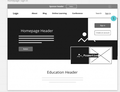
 6. Wireframe.CC
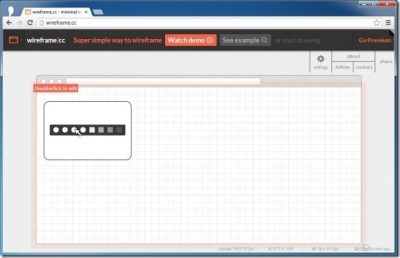
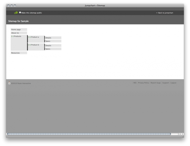

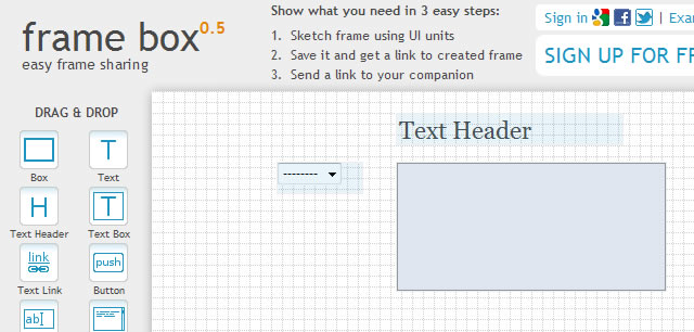
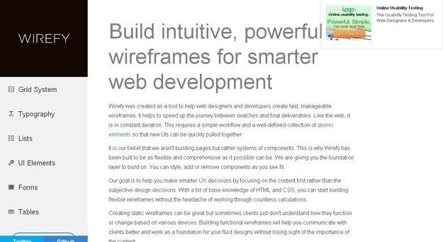


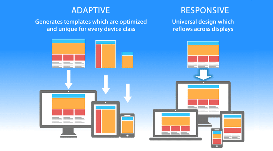
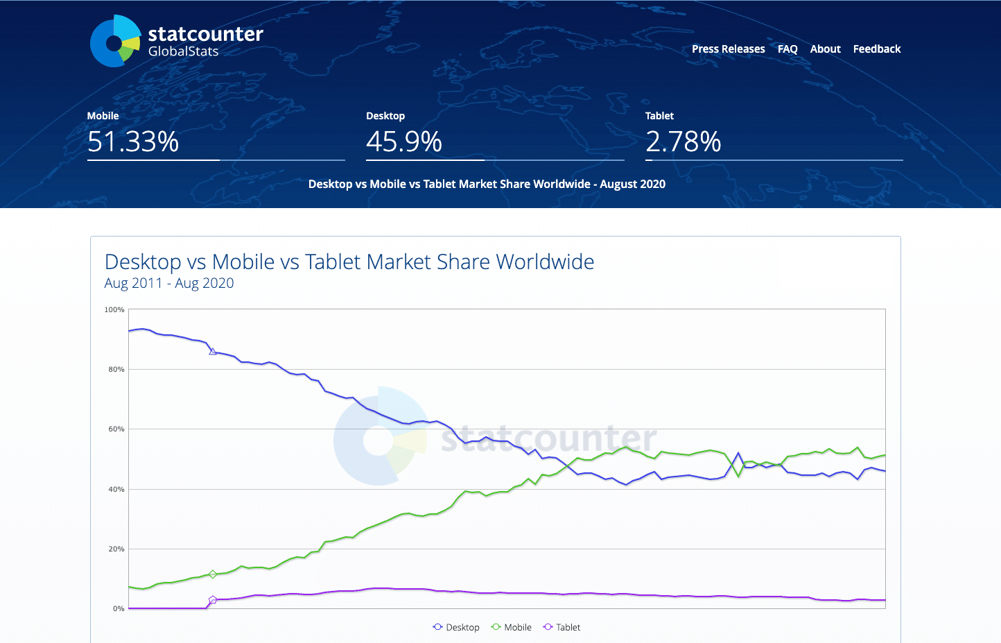
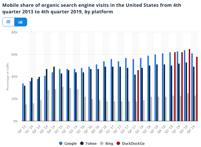

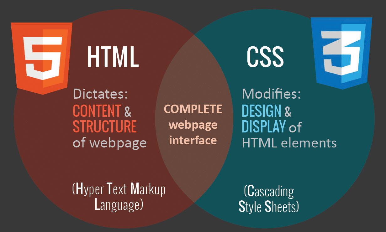
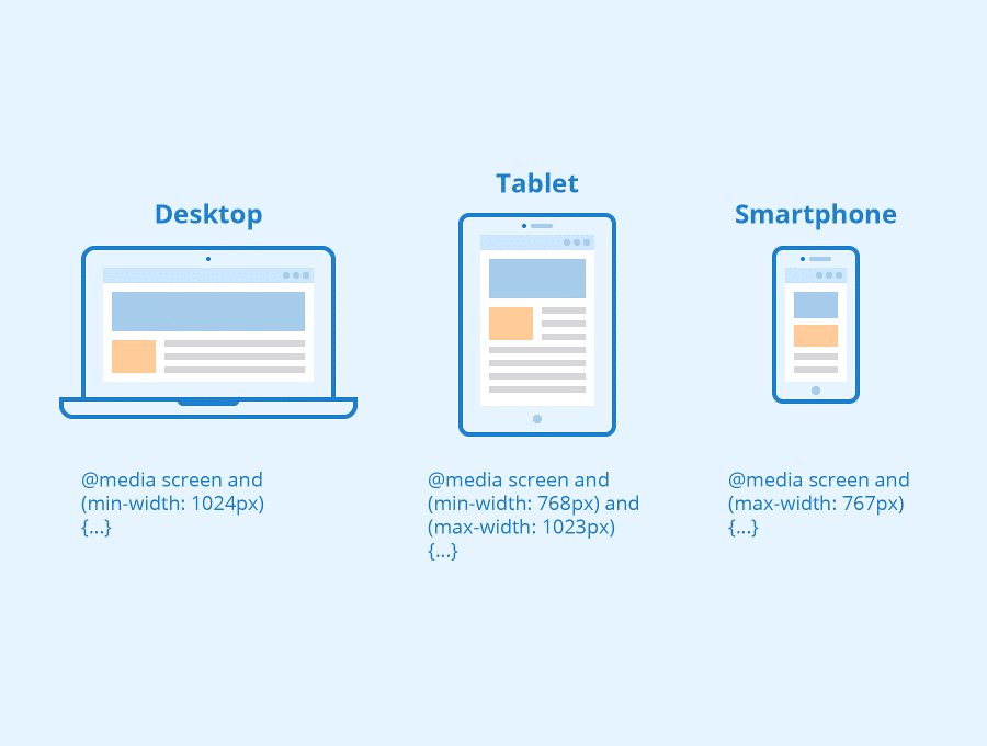
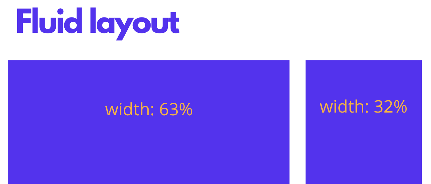

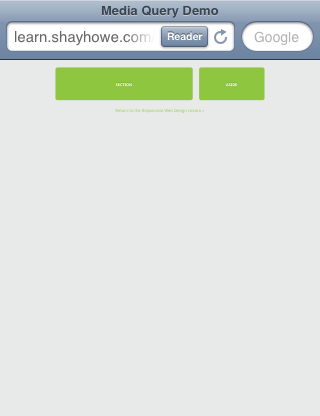
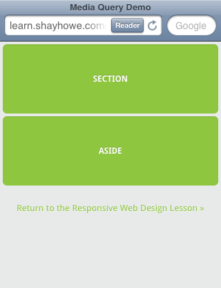
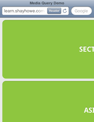


