Image source map insect: used by the stationmaster’s home
With the increasing traffic of mobile websites, having a mobile-friendly website is an important factor in enhancing the influence of the website. Search engines such as Google also strongly enhance the mobile search experience. However, many desktop websites may not be very mobile. Easy to browse and use. Therefore, having a mobile-friendly website is an important factor in increasing online presence. In order to facilitate webmasters’ optimization of the original desktop website on mobile devices, Google launched the “mobile device usability” tool to help webmasters optimize their websites.
Tool usage
Note that this easy-to-use tool uses the Google domain name and needs to be over the wall to access it. If you don’t over the wall, please ignore and skip this article.
The entire website test:
Visit Google Webmaster and add a website to the tool to test mobile device usability for all pages of the entire site.
Single web page test:
Mobile Suitability Test Tool: https://search.google.com/test/mobile-friendly
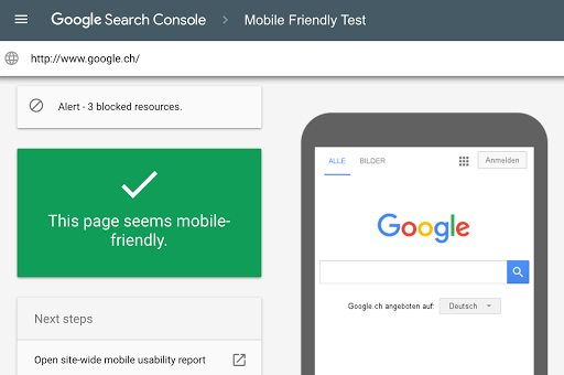
After opening this URL, enter the full URL of the webpage to be tested. Click Run Test, the system will crawl the webpage and conduct test tracking. Usually the test process will not exceed one minute.
The test results include two parts: a screenshot of the appearance of the corresponding web page on the mobile device, and a list of all mobile device usability issues discovered by the tool. Issues related to ease of use on mobile devices are issues that affect users who use mobile (small screen) devices to access the page, including fonts that are too small (it’s hard to see on small screens) and use Flash ( Most mobile devices don’t support Flash) and so on.
Sometimes, the screenshots displayed by the test results are not normal. It may be that the test fails to load all the resources used by the corresponding webpage. It will display a warning message that the webpage contains resources that cannot be loaded. These resources refer to the external elements contained in the webpage, such as Image, CSS, or script file. The main reason for this problem may be that the webmaster sets robots.txt to prohibit the search engine from accessing the corresponding resources. Just modify the robots.txt and unblock the search engine from accessing this resource.
Tool Optimization Guide
The mobile device suitability test tool can detect the following usability errors. We can modify the corresponding errors one by one. The specific optimization and modification methods are as follows:
1, using an incompatible plugin
The page uses a plugin such as Flash to remove Flash or use HTML5 instead.
2, no viewport is set
The page does not define the viewport attribute. Just add the following line to the page header.
<meta name=”viewport” content=”width=device-width, initial-scale=1″ />
3, the text is too small to read
Web page fonts are too small, and mobile device users need to “make two fingers to zoom” before they can read the content on these pages. This is actually the same problem as the previous one. This problem can be solved by simply defining the viewport attribute on the web page.
4, the content width exceeds the screen display range
The webpage needs to scroll horizontally to view the text and images. This means that the CSS style of some elements in the page uses the absolute value of the width, such as the 980px width of the image and the table. The modification of this problem is in css. Use a responsive design approach that uses css for mobile devices to set the width to a relative value or hide some of the elements when the browser width is between 0 and 640 pixels. The sample code is as follows:
@media screen and (max-width:640px) {
#divMain {
Width:100%;
}
#divSidebar {
Display:none;
}
}
5, the distance between clickable elements is too close
The spacing of elements on a web page, such as buttons and navigation links, is too small, causing mobile device users to typically press adjacent elements when they tap on the desired element with their finger. This problem can also be used to increase the row height on mobile devices using a responsive design approach. The sample code is as follows:
@media screen and (max-width:640px) {
p {
Line-height: 150%;
}
}
to sum up
Once you’ve fixed these issues, click “Verify Fix” to have the search engine re-verify the site page and fix the issue of mobile device usability that affects the site.
If the problem is not fixed for a long time, the mobile version of the website will not provide a satisfactory browsing experience, then the ranking of the website will be reduced in the mobile search results, resulting in loss of traffic, so the webmaster of the website will act quickly. , use the Google Mobile Device Ease of Use tool to optimize your mobile website right away.


